
@OswalldSubmitted 5 months ago

P
Gonzalo Tejada
@vgt3j4d4All comments
- P@vgt3j4d4Posted about 2 months ago
-
Does the solution include semantic HTML? Kind of. I think a
<main>tag could have been used. Also a<section>before the<h1>. -
Is it accessible, and what improvements could be made? Visually impared users might have trouble knowing that where an the generated password is after clicking on the GENERATE button. The basic way to implement this is with an element with
aria-liveattribute. See this. -
Does the layout look good on a range of screen sizes? Not as needed. On devices with
320pxwidth the screen looks weird. Also there were no breakpoints being applied so the dimensions don't change depending on the screens. As tailwind is being used you can check: Responsive design and Using custom breakpoints -
Is the code well-structured, readable, and reusable? Yes
-
Does the solution differ considerably from the design? Well it doesn't change depending on mobile or tablet. Aside of that I find the solution good.
0 -
- @MaflacsSubmitted 7 months agoP@vgt3j4d4Posted 5 months ago
-
Does the solution include semantic HTML? Yes
-
Is it accessible, and what improvements could be made? I believe any modifications in the Bill, Tip % and Number of People resulting in Tip calculations updates, should be notified to screen readers. For this,
aria-liveis helpful. -
Does the layout look good on a range of screen sizes? Yeah
-
Is the code well-structured, readable, and reusable? Yes
-
Does the solution differ considerably from the design? Yes it does. Paddings, font sizes and tip buttons layout on mobile devices differ.
Marked as helpful1 -
- @tatasadiSubmitted about 1 year agoP@vgt3j4d4Posted 5 months ago
-
Does the solution include semantic HTML? Yes
-
Is it accessible, and what improvements could be made?
nav > ul > litrigger the action of changing the data depending on the selected frequency. I see aonClickevent handler but this will only work with a mouse or in a touchable interface. In order to become fully accessible it should also work with the keyboard. A quick fix would be to useaorbutton.IconEllipsiswill eventually become a button and thus will be focusable. If not using a button, probably would be good to addtabindexandrole=button`. -
Does the layout look good on a range of screen sizes? Yes. I do like the view on tablets and I'll admit I forgot to implement it :(
-
Is the code well-structured, readable, and reusable? Yes. Using React components.
-
Does the solution differ considerably from the design? Just a little bit. For example, the separation between
liitems. Ando also theCardelements seems to be using a differentborder-radiuswhich is not really the case but something is happening as you can see the background color of theCardin the bottom borders. I think you can useflexin theCardand make the text content move to the bottom usingself-end.
Marked as helpful1 -
- P@edpauSubmitted 6 months agoWhat specific areas of your project would you like help with?
I am trying to improve my TS and JS skills, please kindly comment on my code.
I am also looking into how to set explicit width and height on the SVG to reduce layout shifts and improve CLS, while making the SVG responsive, please advise the best practice.
P@vgt3j4d4Posted 6 months ago-
Does the solution include semantic HTML? Yes
-
Is it accessible, and what improvements could be made? Yes (using aria-live for error notifications)
-
Does the layout look good on a range of screen sizes? Yes
-
Is the code well-structured, readable, and reusable? Yes
-
Does the solution differ considerably from the design? No
-
What specific areas of your project would you like help with?
I am trying to improve my TS and JS skills, please kindly comment on my code. I am also looking into how to set explicit width and height on the SVG to reduce layout shifts and improve CLS, while making the SVG responsive, please advise the best practice.
I find the code OK.
1 -
- @MuliroMattSubmitted 11 months agoWhat are you most proud of, and what would you do differently next time?
.
What challenges did you encounter, and how did you overcome them?.
What specific areas of your project would you like help with?I'm up to any suggestions
P@vgt3j4d4Posted 6 months ago-
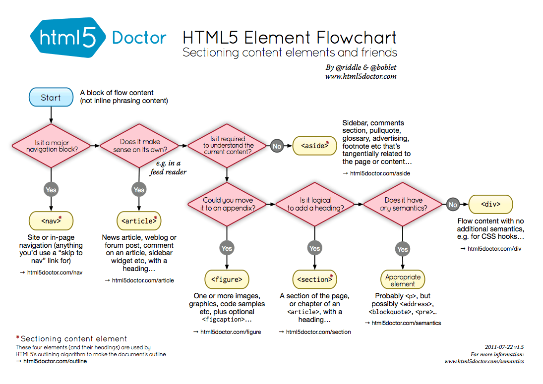
Does the solution include semantic HTML? Mmmm it could be improved I believe. There is no
<main>.<section>has been used but I don't think it fits there, same as<i>. You could find this useful HTML5 Element Flow Chart -
Is it accessible, and what improvements could be made? Not sure if
<picture>is needed (as there is only 1 image under it). Also,altproperties on images could be more descriptive. Moreover, the share button ends up opening a "section", either at the bottom or as a tooltip. For thataria-expandedandaria-controlscould be benefitial. Another thing is that, the share links should be accesible using the keyboard, and that's not possible with your approach. Consider changing thespan.share-iconto a button and making the share links<a>or<button>. That way the user will be able to navigate through them using the keyboard and something can be done once the user clicks them. -
Does the layout look good on a range of screen sizes? Kind of. When changing the screen size from landspace to portrait mode, I see the image scales which not sure is expected.
-
Is the code well-structured, readable, and reusable? Yes.
-
Does the solution differ considerably from the design? No.
-
What specific areas of your project would you like help with? I think you are trying to use BEM but I'm not really sure as I see class names like
card__content__text__titlewhich is violating BEM. Check this for more information MindBEMding. Also, I see you added the font import inside_reset.scss, maybe put it in a separate file or instyle.scss.
0 -
- @khanwelcomesSubmitted 6 months agoWhat are you most proud of, and what would you do differently next time?
Identifying the required layout styling the borders.
What challenges did you encounter, and how did you overcome them?Identifying the exact spacing between elements and the font properties was challenging. Using the figma file i could figure out.
What specific areas of your project would you like help with?is the code efficient and readme file proffessional?
P@vgt3j4d4Posted 6 months ago-
Does the solution include semantic HTML? Yes, maybe
div.text(div with the class text) can be switched to<article>or<section>. You might find this useful [HTML5 Element Flowchart].(https://html5doctor.com/downloads/h5d-sectioning-flowchart.png) -
Is it accessible, and what improvements could be made? Yes. Still I believe the
altproperty could add more context i.e.: QR code to visit Frontend Mentor and take your coding skills to the next level -
Does the layout look good on a range of screen sizes? Yes
-
Is the code well-structured, readable, and reusable? I believe the css could have been written in a separate file and include it as a
<link>tag -
Does the solution differ considerably from the design? No
- What specific areas of your project would you like help with? > Is the code efficient and readme file proffessional?
The code is simple as I said above a separate .css file would help to separate the logic. Remember to remove the original
README.mdand renameREADME-template.mdtoREADME.md. TheBuilt Withsection I believe needs to be updated.
Marked as helpful0 -
- @frontend-enSubmitted 12 months agoWhat are you most proud of, and what would you do differently next time?
I'm proud that I was able to set up a responsive layout.
Next time I would like to use a grid
What challenges did you encounter, and how did you overcome them?I was faced with the fact that I didn’t understand how to layout the site’s header, but then I decided to start with the mobile version and then when I made the mobile version, it became clear how to create a desktop
What specific areas of your project would you like help with?I think I could use some help with semantics.
P@vgt3j4d4Posted 6 months ago-
Does the solution include semantic HTML? Yes. Still I'm not really sure if
<header>and<footer>are the best fit for the top and bottom sections we have on this challenge (I see you asked for help on semantics). -
Is it accessible, and what improvements could be made? It is using semantic html but I believe the
altproperty on the images can be more descritive, the buttons might havearia-labels and add more desscription. -
Does the layout look good on a range of screen sizes? Yes but I believe the top image could have change it's width while changing from mobile to tablet. The images at the middle of the page can also change their dimensions accordingly.
-
Is the code well-structured, readable, and reusable? Yes
-
Does the solution differ considerably from the design? Not much. I see there are multiple
@mediabreakpoints in the finalstyles.cssfile. Maybe those can be simplified and group all the related media queries together.
0 -
- @vict-codeSubmitted 7 months agoP@vgt3j4d4Posted 7 months ago
-
Does the solution include semantic HTML? It could improve like using
<blockquote>(for each of the quotes) and maybe<header>(for the top section having the profile pic and name and verification). -
Is it accessible, and what improvements could be made? There is definitely room for improvement. The image of the quote used in Daniel's card could have been done with just a background image and then there is no need to use an element that could be discoverable by screen readers. Also, the "alt" property doesn't give much helpful information in that case. Maybe use
<section>for the cards? Please check Alternatives to using divs and -
Does the layout look good on a range of screen sizes? In desktop it should be centered (vertically and horizontally) and it should acommodate nicely which is not happening until the mobile breakpoint is reached (425px). Remember the challenge was meant to use css grid. Thus the main container should wrap all cards (including the one for Kira). Here is my solution for you to check and some othere I found better than mine
-
Is the code well-structured, readable, and reusable? Well I believe readability and reusability will improve if we use BEM naming convention and a pre processor like Sass. These 2 things are not really complicated and I believe it would really help you if you start using it in the next projects.
-
Does the solution differ considerably from the design? Well, yes. The good thing is that it is not much different. I would recommend to try to redoing it using css grid (grid-template-rows, grid-template-columns and grid-template-areas).
0 -
- @El0mdaSubmitted 7 months agoP@vgt3j4d4Posted 7 months ago
-
Does the solution include semantic HTML? Not much (more on the next question answer)
-
Is it accessible, and what improvements could be made? I see it is using only
<div>,<h1>,<h2>,<h3>,<p>,<span>but some other tags could have been used to improve accessibility (help screen readers and people with visual impairements). Like<header>,<ol>(ordered list, so you don't need to manually add the list number in the Ingredients section. Probably<section>and<em>or<strong>tags could have been used too. Check this one: Alternatives to using divs you might find it helpful. -
Does the layout look good on a range of screen sizes? Well, looks good on Desktop and Mobile. One thing I found was that even though
-
Is the code well-structured, readable, and reusable? Well I believe readability and reusability will improve if we use BEM naming convention and a pre processor like Sass. These 2 things are not really complicated and I believe it would really help you if you start using it in the next projects.
-
Does the solution differ considerably from the design? Not much.
0 -
- @JamesLavironSubmitted 7 months agoWhat are you most proud of, and what would you do differently next time?
I'm proud of the ways I used grids. I tried to make it clean and adaptable to tablets. I'm proud of how I anticipated the time it would take to do it.
I would maybe try to focus more on mobile first but still anticipating more desktop and tablet behaviours.
What challenges did you encounter, and how did you overcome them?I encountered a challenge on how to organize classes and file tree using BEM technology.
What specific areas of your project would you like help with?I'd like help to understand if I understood well BEM technology. Hwat could I have done differently in order to make it more reusable? Thanks :).
P@vgt3j4d4Posted 7 months ago-
Does the solution include semantic HTML? Yes, definitely!
-
Is it accessible, and what improvements could be made? I believe it is ok.
-
Does the layout look good on a range of screen sizes? Yes, I see it look good not only in mobile and desktop but the grid accomodates itself depending on the dimensions of the viewport. Well done! (I have to admit I only thought on Desktop and Mobile)
-
Is the code well-structured, readable, and reusable? Yes, specially using separately .scss files (partials)
-
Does the solution differ considerably from the design? Nope
- What specific areas of your project would you like help with? I'd like help to understand if I understood well BEM technology. Hwat could I have done differently in order to make it more reusable? Thanks :). I believe it is pretty reusable, not only using scss but the way things were organized. Also, the naming of the css classes, mixins, etc :)
Marked as helpful0 -
- @cucumerisGITSubmitted 7 months agoWhat are you most proud of, and what would you do differently next time?
I learned how to use SCSS and BEM for this page and it helped me organize the files better. The naming of some classes could be a bit more specific if the project was bigger but for such a small project i think it's sufficient. The page is also way more responsive than other projects i did before, which i am most proud of.
What challenges did you encounter, and how did you overcome them?First i did not understand the purpose of BEM but after implementing it on the page and reading a bit about it i now understand that it helps organizing and scaling pages since i can reuse much of the component i create.
What specific areas of your project would you like help with?I would appreciate feedback on the responsiveness, specifically if i used the media query correctly and if i should use something else than px for max-width. Also i would welcome feedback on optimization of the CSS.
P@vgt3j4d4Posted 7 months ago-
Does the solution include semantic HTML?
Yes -
Is it accessible, and what improvements could be made?
Yes. Although I see you addedordercss property. I would avoid using it unless it is really necessary but in my experience 99% of the cases you don't need it. Here is more information about it a11y issues using order in grid and flex -
Does the layout look good on a range of screen sizes? On mobile devices it needs some tweaking. Setting a fixed width to the cards would do the trick (you'll need to update the width on tablet/desktop)
-
Is the code well-structured, readable, and reusable?
Yes -
Does the solution differ considerably from the design?
Yeah a bit (font sizes, vertical alignment, box shadows, paddings). I also have my solution differing considerably but you might want to check it to cross check yours.
Marked as helpful0 -
- @mts-mlSubmitted 8 months agoWhat are you most proud of, and what would you do differently next time?
I liked the layout on different devices.
What challenges did you encounter, and how did you overcome them?Without Figma, it's a little hard to get the sizes 100% correct.
What specific areas of your project would you like help with?Constructive criticism and tips are welcome.
P@vgt3j4d4Posted 7 months ago- Does the solution include semantic HTML?
it is using
<main>and<article>. I'm not really sure if<article>applies but I do believe<header>could have been used. I found this in Frontend Mentor Discord which might help you. This might be helpful too HTML5 alternatives to div. - Is it accessible, and what improvements could be made? Use more semantic html
- Does the layout look good on a range of screen sizes? I think it can be improved. I have access to the figma files I was able to get the precise dimensions which I'm pretty close to match my solution here
- Is the code well-structured, readable, and reusable? yeah
- Does the solution differ considerably from the design? yes, I believe in the mobile version the solution is not really matching the design
0 - Does the solution include semantic HTML?
it is using
- @0gsar1mSubmitted 7 months agoWhat are you most proud of, and what would you do differently next time?
I was happy to see that I grasped the flex and grid structure. I also realized that I understood how to build a container structure according to the current necessity. If I were to make a difference, it would be to make all padding and margin values regular and to make the word accents in the list elements through css instead of html.
What challenges did you encounter, and how did you overcome them?As a personal problem, I had a hard time putting the elements and values in the nutritions section into the flex structure, but when I gave new containers in html and made the correct class names, my problem was solved. Thank you in advance
What specific areas of your project would you like help with?The “I would have made a difference” part may be valid.
P@vgt3j4d4Posted 7 months agoHey, you can use https://app.netlify.com/ to host your challenge solutions. Here are instructions on how to https://docs.netlify.com/welcome/add-new-site/. If you need more help, let me know here. I'll find some time to help but the process is pretty straightforward.
0 - @efabrizio75Submitted 7 months agoWhat are you most proud of, and what would you do differently next time?
I am glad I got to implement Rich Data. Next time I would use a different approach for type setting and assign properties based on element selectors.
What challenges did you encounter, and how did you overcome them?It was tricky to get the image to be responsive.
What specific areas of your project would you like help with?What do you guys suggest to place the image? Is it better to use only the
picturetag and forget 15+ years old browser?P@vgt3j4d4Posted 7 months ago- Does the solution include semantic HTML? Yes
- Is it accessible, and what improvements could be made? Yes. Maybe section tags could use arialabeledby and reference the inner h2 element.
- Does the layout look good on a range of screen sizes? Sort of. It not strictly following the design though (paddings, dimensions)
- Is the code well-structured, readable, and reusable? Yes
- Does the solution differ considerably from the design? Yes, you can see it live in the solution vs design above
What challenges did you encounter, and how did you overcome them? It was tricky to get the image to be responsive. I simply opted on using 2 different img tags and show/hide them using media queries. I've seen people following this approach and cache will help not to download the image twice.
What specific areas of your project would you like help with? What do you guys suggest to place the image? Is it better to use only the picture tag and forget 15+ years old browser? I believe picture is required when different images versions/sizes apply and you need a way to choose which one to use depending on the dimensions. 15+ years old browsers may be discarded imho
0 - @DawidOwidzkiSubmitted 8 months agoP@vgt3j4d4Posted 8 months ago
- Does the solution include semantic HTML? yes
- Is it accessible, and what improvements could be made? well yes, still a <nav> could have been used.
- Does the layout look good on a range of screen sizes? yes but not strictly equals to the figma design (there .social-profile element have different widths depending if mobile, tablet, desktop)
- Is the code well-structured, readable, and reusable? yes
- Does the solution differ considerably from the design? Not really. Aside of the responsiveness issue (see above) the hover state of the link buttons should be green according to figma
0 - @Jaimealicante83Submitted 8 months agoWhat are you most proud of, and what would you do differently next time?
It was easy to do, I think I did it look like the design. I would check more the details next time
P@vgt3j4d4Posted 8 months ago- Does the solution include semantic HTML? yes
- Is it accessible, and what improvements could be made?
- Does the layout look good on a range of screen sizes? yes (but check my comments at the bottom)
- Is the code well-structured, readable, and reusable? yes
- Does the solution differ considerably from the design?
No, but I see there are a few things missing:
- The "Learning" pill is missing the border
- There are no hover, active state styles applied (check figma file)
- The person avatar should be black&white (I miss this too)
- The title is moving funny while changing the browser dimensions
0 - P@gajbos99Submitted 8 months agoWhat are you most proud of, and what would you do differently next time?
Feeling more comfortable with css.
What challenges did you encounter, and how did you overcome them?/
What specific areas of your project would you like help with?/
P@vgt3j4d4Posted 8 months ago-
Does the solution include semantic HTML? yes
-
Is it accessible, and what improvements could be made? I see you're using pixels instead of relative units. I believe it would be better using rem/em https://www.freecodecamp.org/news/css-units-when-to-use-each-one/#:~:text=It's%20a%20good%20idea%20to,This%20helps%20with%20accessibility.
-
Does the layout look good on a range of screen sizes? yes
-
Is the code well-structured, readable, and reusable? yes, and since you are using sass, I believe using additional partial files for css reset, variables, etc. will help reusability (although this is pretty simple but I helps for future more complex websites) https://www.w3schools.com/sass/sass_import.php#:~:text=Sass%20Partials,are%20called%20partials%20in%20Sass.
-
Does the solution differ considerably from the design? no
0 -


