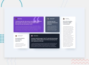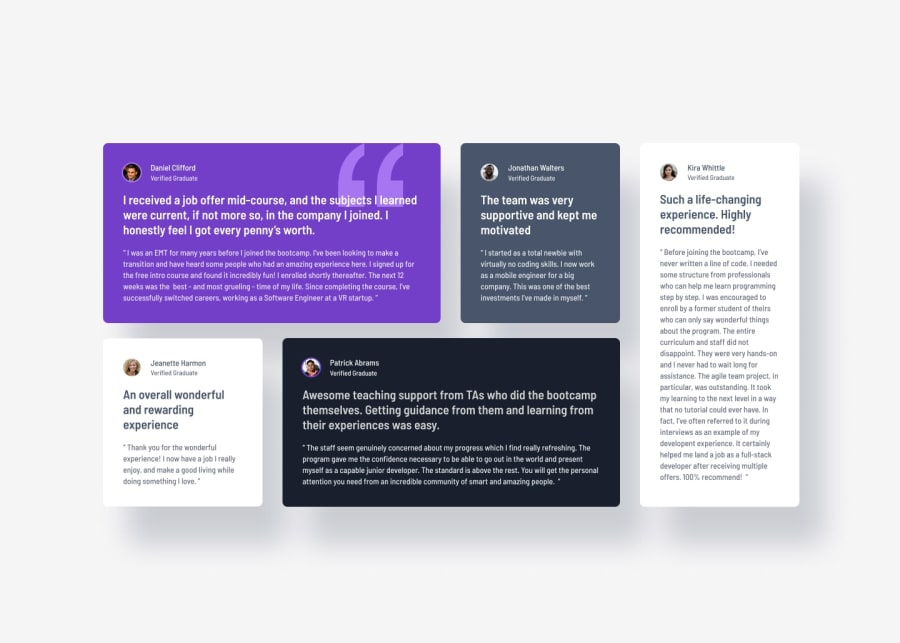
Design comparison
Community feedback
- P@vgt3j4d4Posted 7 months ago
-
Does the solution include semantic HTML? It could improve like using
<blockquote>(for each of the quotes) and maybe<header>(for the top section having the profile pic and name and verification). -
Is it accessible, and what improvements could be made? There is definitely room for improvement. The image of the quote used in Daniel's card could have been done with just a background image and then there is no need to use an element that could be discoverable by screen readers. Also, the "alt" property doesn't give much helpful information in that case. Maybe use
<section>for the cards? Please check Alternatives to using divs and -
Does the layout look good on a range of screen sizes? In desktop it should be centered (vertically and horizontally) and it should acommodate nicely which is not happening until the mobile breakpoint is reached (425px). Remember the challenge was meant to use css grid. Thus the main container should wrap all cards (including the one for Kira). Here is my solution for you to check and some othere I found better than mine
-
Is the code well-structured, readable, and reusable? Well I believe readability and reusability will improve if we use BEM naming convention and a pre processor like Sass. These 2 things are not really complicated and I believe it would really help you if you start using it in the next projects.
-
Does the solution differ considerably from the design? Well, yes. The good thing is that it is not much different. I would recommend to try to redoing it using css grid (grid-template-rows, grid-template-columns and grid-template-areas).
0 -
Please log in to post a comment
Log in with GitHubJoin our Discord community
Join thousands of Frontend Mentor community members taking the challenges, sharing resources, helping each other, and chatting about all things front-end!
Join our Discord
