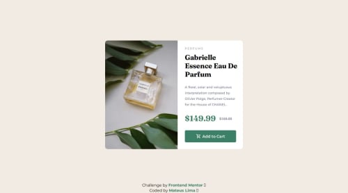
Design comparison
SolutionDesign
Solution retrospective
What are you most proud of, and what would you do differently next time?
I liked the layout on different devices.
What challenges did you encounter, and how did you overcome them?Without Figma, it's a little hard to get the sizes 100% correct.
What specific areas of your project would you like help with?Constructive criticism and tips are welcome.
Community feedback
- @vgt3j4d4Posted 3 months ago
- Does the solution include semantic HTML?
it is using
<main>
and<article>
. I'm not really sure if<article>
applies but I do believe<header>
could have been used. I found this in Frontend Mentor Discord which might help you. This might be helpful too HTML5 alternatives to div. - Is it accessible, and what improvements could be made? Use more semantic html
- Does the layout look good on a range of screen sizes? I think it can be improved. I have access to the figma files I was able to get the precise dimensions which I'm pretty close to match my solution here
- Is the code well-structured, readable, and reusable? yeah
- Does the solution differ considerably from the design? yes, I believe in the mobile version the solution is not really matching the design
0@vgt3j4d4Posted 2 months ago@mts-ml after working on some more challenges I'm starting to think that
<article>
is ok. Just wanted to point out that :)0@mts-mlPosted 2 months agoHey @vgt3j4d4 !
What I've found reading is that article should be used as independent from the rest of the tags, in this challenge, I could've used just a
<main>
tag and some<div>
, without article and aside, since it's a pretty small project.1 - Does the solution include semantic HTML?
it is using
Please log in to post a comment
Log in with GitHubJoin our Discord community
Join thousands of Frontend Mentor community members taking the challenges, sharing resources, helping each other, and chatting about all things front-end!
Join our Discord