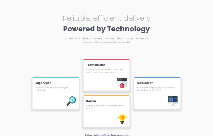
Four card feature section using SCSS and BEM
Design comparison
Solution retrospective
I learned how to use SCSS and BEM for this page and it helped me organize the files better. The naming of some classes could be a bit more specific if the project was bigger but for such a small project i think it's sufficient. The page is also way more responsive than other projects i did before, which i am most proud of.
What challenges did you encounter, and how did you overcome them?First i did not understand the purpose of BEM but after implementing it on the page and reading a bit about it i now understand that it helps organizing and scaling pages since i can reuse much of the component i create.
What specific areas of your project would you like help with?I would appreciate feedback on the responsiveness, specifically if i used the media query correctly and if i should use something else than px for max-width. Also i would welcome feedback on optimization of the CSS.
Community feedback
- P@vgt3j4d4Posted 7 months ago
-
Does the solution include semantic HTML?
Yes -
Is it accessible, and what improvements could be made?
Yes. Although I see you addedordercss property. I would avoid using it unless it is really necessary but in my experience 99% of the cases you don't need it. Here is more information about it a11y issues using order in grid and flex -
Does the layout look good on a range of screen sizes? On mobile devices it needs some tweaking. Setting a fixed width to the cards would do the trick (you'll need to update the width on tablet/desktop)
-
Is the code well-structured, readable, and reusable?
Yes -
Does the solution differ considerably from the design?
Yeah a bit (font sizes, vertical alignment, box shadows, paddings). I also have my solution differing considerably but you might want to check it to cross check yours.
Marked as helpful0 -
Please log in to post a comment
Log in with GitHubJoin our Discord community
Join thousands of Frontend Mentor community members taking the challenges, sharing resources, helping each other, and chatting about all things front-end!
Join our Discord
