- Semantic HTML5 markup - CSS custom properties - Flexbox - CSS Grid -
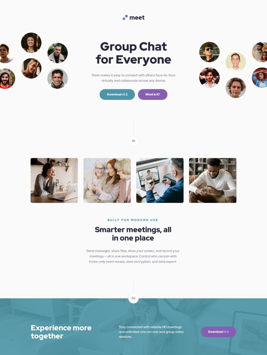
Design comparison
Solution retrospective
I'm proud that I was able to set up a responsive layout.
Next time I would like to use a grid
What challenges did you encounter, and how did you overcome them?I was faced with the fact that I didn’t understand how to layout the site’s header, but then I decided to start with the mobile version and then when I made the mobile version, it became clear how to create a desktop
What specific areas of your project would you like help with?I think I could use some help with semantics.
Community feedback
- P@vgt3j4d4Posted 7 months ago
-
Does the solution include semantic HTML? Yes. Still I'm not really sure if
<header>and<footer>are the best fit for the top and bottom sections we have on this challenge (I see you asked for help on semantics). -
Is it accessible, and what improvements could be made? It is using semantic html but I believe the
altproperty on the images can be more descritive, the buttons might havearia-labels and add more desscription. -
Does the layout look good on a range of screen sizes? Yes but I believe the top image could have change it's width while changing from mobile to tablet. The images at the middle of the page can also change their dimensions accordingly.
-
Is the code well-structured, readable, and reusable? Yes
-
Does the solution differ considerably from the design? Not much. I see there are multiple
@mediabreakpoints in the finalstyles.cssfile. Maybe those can be simplified and group all the related media queries together.
0 -
Please log in to post a comment
Log in with GitHubJoin our Discord community
Join thousands of Frontend Mentor community members taking the challenges, sharing resources, helping each other, and chatting about all things front-end!
Join our Discord
