Solution retrospective
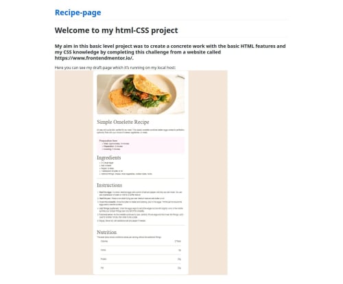
I was happy to see that I grasped the flex and grid structure. I also realized that I understood how to build a container structure according to the current necessity. If I were to make a difference, it would be to make all padding and margin values regular and to make the word accents in the list elements through css instead of html.
What challenges did you encounter, and how did you overcome them?As a personal problem, I had a hard time putting the elements and values in the nutritions section into the flex structure, but when I gave new containers in html and made the correct class names, my problem was solved. Thank you in advance
What specific areas of your project would you like help with?The “I would have made a difference” part may be valid.
Please log in to post a comment
Log in with GitHubCommunity feedback
No feedback yet. Be the first to give feedback on Emir Kaan Oğşarim's solution.
Join our Discord community
Join thousands of Frontend Mentor community members taking the challenges, sharing resources, helping each other, and chatting about all things front-end!
Join our Discord