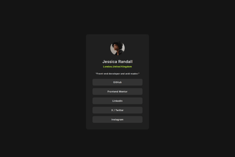
Design comparison
SolutionDesign
Community feedback
- P@vgt3j4d4Posted 8 months ago
- Does the solution include semantic HTML? yes
- Is it accessible, and what improvements could be made? well yes, still a <nav> could have been used.
- Does the layout look good on a range of screen sizes? yes but not strictly equals to the figma design (there .social-profile element have different widths depending if mobile, tablet, desktop)
- Is the code well-structured, readable, and reusable? yes
- Does the solution differ considerably from the design? Not really. Aside of the responsiveness issue (see above) the hover state of the link buttons should be green according to figma
0
Please log in to post a comment
Log in with GitHubJoin our Discord community
Join thousands of Frontend Mentor community members taking the challenges, sharing resources, helping each other, and chatting about all things front-end!
Join our Discord
