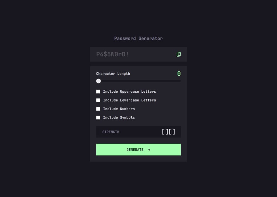

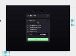
Design comparison

Community feedback
- P@vgt3j4d4Posted about 2 months ago
-
Does the solution include semantic HTML? Kind of. I think a
<main>tag could have been used. Also a<section>before the<h1>. -
Is it accessible, and what improvements could be made? Visually impared users might have trouble knowing that where an the generated password is after clicking on the GENERATE button. The basic way to implement this is with an element with
aria-liveattribute. See this. -
Does the layout look good on a range of screen sizes? Not as needed. On devices with
320pxwidth the screen looks weird. Also there were no breakpoints being applied so the dimensions don't change depending on the screens. As tailwind is being used you can check: Responsive design and Using custom breakpoints -
Is the code well-structured, readable, and reusable? Yes
-
Does the solution differ considerably from the design? Well it doesn't change depending on mobile or tablet. Aside of that I find the solution good.
0 -

Please log in to post a comment
Log in with GitHubJoin our Discord community
Join thousands of Frontend Mentor community members taking the challenges, sharing resources, helping each other, and chatting about all things front-end!
Join our Discord