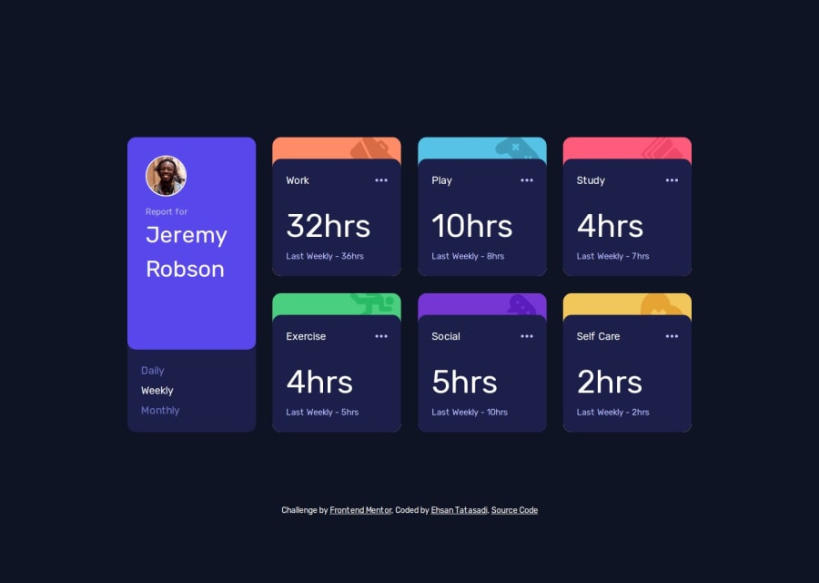
Time Tracking Dashboard (Nextjs + React + Tailwind)
Design comparison
Community feedback
- P@vgt3j4d4Posted 5 months ago
-
Does the solution include semantic HTML? Yes
-
Is it accessible, and what improvements could be made?
nav > ul > litrigger the action of changing the data depending on the selected frequency. I see aonClickevent handler but this will only work with a mouse or in a touchable interface. In order to become fully accessible it should also work with the keyboard. A quick fix would be to useaorbutton.IconEllipsiswill eventually become a button and thus will be focusable. If not using a button, probably would be good to addtabindexandrole=button`. -
Does the layout look good on a range of screen sizes? Yes. I do like the view on tablets and I'll admit I forgot to implement it :(
-
Is the code well-structured, readable, and reusable? Yes. Using React components.
-
Does the solution differ considerably from the design? Just a little bit. For example, the separation between
liitems. Ando also theCardelements seems to be using a differentborder-radiuswhich is not really the case but something is happening as you can see the background color of theCardin the bottom borders. I think you can useflexin theCardand make the text content move to the bottom usingself-end.
Marked as helpful1 -
Please log in to post a comment
Log in with GitHubJoin our Discord community
Join thousands of Frontend Mentor community members taking the challenges, sharing resources, helping each other, and chatting about all things front-end!
Join our Discord
