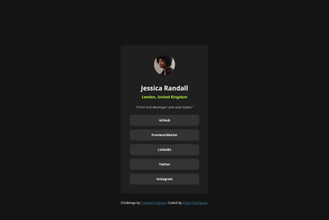
P
@itadori-kunSubmitted 5 months ago
What are you most proud of, and what would you do differently next time?
My First time working with NextJs and TailwindCss. Still lots of room for improvements

My First time working with NextJs and TailwindCss. Still lots of room for improvements
Youres looks great honestly. I didn't go in too deep on this one as there was so much that was completely new to me. I noticed I should work on my font implementation and how I handle errors looking at your code really helped thank you :).
Organizing the content at the card, and maybe there is a more efficient way for styling the list of links.
What challenges did you encounter, and how did you overcome them?Making the clickable area of the links at the size of the list item. I changed the link display to block and set the height 100%.
What specific areas of your project would you like help with?A better use of "display".
Hey good job on the challenge just for some points to make it a little nicer.
body{
width: 100vw;
height: 100vh;
display: flex;
justify-content: center;
align-items: center;
should be good enough to center the div no need to create a main just a container for the whole card. Also for the link you can just create a div that contains the boxes
<div className='buttonBox'>
<button></button>
<button></button>
<button></button>
<button></button>
</div>

style.css
.buttonBox{
display:flex;
flex-direction:column;
.buttonBox{
background-color: blue //or whatever color for the hover affect
}
Make sure to play around with hover and focus affect. Also look into scss to help make css a little easier to use or maybe even tailwind when you get used to css :) good luck
Hey the project looks great and pretty accurate. I like the filtering (better than mine I only did a one filter at a time) The only thing I would suggest for cleaner looking code is moving the tailwind into a css or scss file importing the css to the componenet and using the @apply
.button {
@apply rounded-lg bg-black text-white hover:bg-white hover:text-black
Hey you don't have the comma fication for the number in the result page. Not 100% on how to do it but in react its
number.toLocalString('en-US')
I'm proud of myself for being patient while going through this first project. I ended up pivoting with how I wrote some of my HTML or CSS, even though it probably would've been better had I outlined my thought process first before delving straight into HTML. In other words putting together some pseudocode even for HTML and CSS to figure out the structure of both, including what types of CSS classes I could use based on the BEM convention.
What challenges did you encounter, and how did you overcome them?The biggest challenges I faced were trying my hand at importing fonts differently than how I was used to, which was by using the @import at-rule and I would always use Google Fonts. I wanted to try to use the files provided within the project, but didn't have a lot of familiarity with the @font-face at-rule and during the first deployment, the fonts were not pulled in properly. I had to figure out the source of the error, and in the process I decided to try out variable fonts, as it was also new to me and I wanted to see if it a worthwhile solution.
Hey, I really liked this challenge I thought it was a good way to get my hands dirty and wasn't too difficult. The only thing I'd suggest is removing the media query as it wasn't too necessary. Also the HTML should be looked over not everything needs a class especially with smaller projects of which have just a handful of elements. It also in my opinon makes styling things a lot easier. Also just to throw it in there you should jump in and try to use SCSS :) I've really been liking the switch.
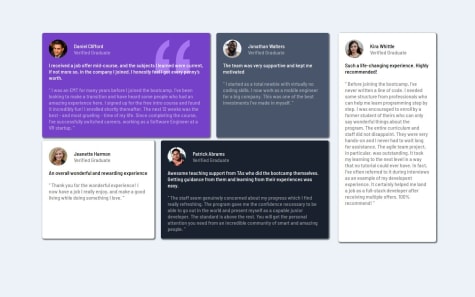
Hey congrats on completing this challenge. This one took a little bit to complete for me. On my screen the grids look really stretched out maybe adding a max-with to the whole container would help with that some thing like 900 px? not too sure. I also see that the kira whittle box is a little bigger than the rest compared to the solution. I would really recomment jumping in a trying to do this challenge with grid instead of flex box. Using grid area template also makes the whole challenge pretty easy. Last thing, changing the media query to switch to one card on top of the other should start a lot sooner maybe whenever it enters tablet sizes like 760-is pixels. Again, Good job :)
I am proud to have understood how to generate a well-defined and organized layout. Next time I will take more time to organize my layout well before everything else.
What challenges did you encounter, and how did you overcome them?First I used float to place the cards but they did not look the way I wanted, then I reviewed the information and saw that I could apply both flex and grid
What specific areas of your project would you like help with?I have done everything. But I would like to know an alternative to making the colored top lines of the cards.
Hey, good job on the project I really liked the added animation to the page makes it unique. The only thing I can point out is the fact that the mobile view is missing ? I also think you'd have a good time learning scss Its really really similar to css but allows nesting so something like:
.card1, .card2, .card3, .card4 {
  .line {
    height: 4px;
  }
}
is possible and makes in my opinion the css code look a little cleaner and easier to handle. :)
I'm proud of my approach to the share pop-up box including how I positioned it, the event listeners I used, and having the box be removed whenever a user clicks anywhere else on the document. Next time I would change the pop-up box's parent element as it ran me into a couple of problems. Namely it made positioning in the mobile version more tricky.
What challenges did you encounter, and how did you overcome them?I didn't encounter any major obstacles. But I hadn't done the "click anywhere" type of event listener before. I knew I needed to add an event listener to the entire document, and ChatGPT helped me with some of the logic.
What specific areas of your project would you like help with?If there any better techniques, specifically with the JS, I would love to hear suggestions.
I used an event listener on the share arrow button to toggle a class
const toggleButton = document.getElementbyId("share");
const buttonBox = document.querySelector(".buttonBox');

toggleButton.addEventListener('click', () =>{
buttonBox.classList.toggle('.active');
}
This toggle will allow the "active" css selector to be added onto the 'buttonBox' div and inherit whatever is there which in my case was simply a display: none; when clicked again it would go away. In the mobile view the share button popup isn't positioned currently positioning it absolutely and adding top: ; left: ; right: ; bottom: ; and playing with those values may help. Good job :)
I am most proud of using grid over flex on this design.
What challenges did you encounter, and how did you overcome them?My main challenge was choosing to go mobile or desktop first on this design. I ultimately started with the tablet view first as I felt that it had the least amount of changes to make at different screen sizes.
What specific areas of your project would you like help with?I still would like to gain a better understanding of grid.
Hey! I like the result and congratulations on finishing it. Just a few things just by looking at the website on desktop view the image doesn't reach the edges not sure if the size is set so the images are restricted in a way or maybe you can try to use
grid-template-column: repeat(3,1fr);
and then play with the individual margin / padding/ width because they can all affect how the grid tries to even the differnt cells out. Using the dev tools will also help see the width and height of each cell and where exactly that height / width is coming from which can be from smaller media quieries and such (It can get pretty hectic pretty quickly) Another thing id like to mention is on tablet view the footer doesn't take up the whole space which might be fixed with a
max-width: 1024px;
width: 100%;
Again this might work unless you've added margin or padding or set the size of it previously in the css that might interfere with the newly written code. Again Congrats :).
I feel like I am getting more comfortable with CSS grids!
What challenges did you encounter, and how did you overcome them?Nothing serious for this one. Aside from some positioning struggles here and there.
What specific areas of your project would you like help with?I tried using data attributes to dynamically (sort of) color my cards and paragraphs inside it. I was wondering if there's a clean way to right the css part without copy pasting it. Maybe some sort of mapping or something similar? If anybody can nudge me in the right direction that would be appreciated!
As always, feedbacks are much appreciated!
Hey, I went a very similar route with mine and honestly yours came out better. I liked that all the cells for the grid moved at the same time mine for some reason only the 5th box would move. The only thing I would say is maybe adding some padding to the wrapper as it looks a little too close to the rest of the screen in comparison to the solution.
The completion of the project and the change to learn grid layouts despite this project not being the cleanest. A combination of grid and flexbox was used.
What challenges did you encounter, and how did you overcome them?My biggest challenge was with grid layout and trying to position the cards to be the same as the preview. There were times where I couldn't get the responsiveness to appear when the screen size changes, so I opted to use flexbox once the screen size was below 800px.
What specific areas of your project would you like help with?Any and all feedback is welcome.
I personally used a regular grid layout something like
grid-template-columns: repeat(auto-fit, minmax(325px, 1fr));
and then when the screen became a bigger size fit for desktop I added the complexity to make the layout more like the preview with grid-template-areas.
The Layout and styling looks pretty good compared to the original. Next time I will build a mobile first layout to make it easier.
What challenges did you encounter, and how did you overcome them?I had difficulty making a flexible responsive layout on all devices.
What specific areas of your project would you like help with?Adjusting the layout so it works on all devices without overflow.
I liked this solution a lot I'm not sure how you got the description (right) side to go over the image little by little as the screen gets smaller but its looks really clean. I had mine kinda stay the same until it hit a certain width and immediently changed it to a mobile layout just cause I thought thats what the design asked for.
Breaking down the design in subsections and handling them. Need to pay attention to semantic tags.
What challenges did you encounter, and how did you overcome them?Finding the right semantic tag, always tempting to just go with div.
What specific areas of your project would you like help with?Nothing
Not much to say yours came out way more accurate than mine. Maybe just the Simple omelette recipe font size but thats about it. Do you have the pro version or something?
Estou muito grato em finalizar esse projeto em pouco tempo. Sinto que meu conhecimento está ficando mais sólido. Nos próximos projetos vou tentar simplificar mais ainda o código.
What challenges did you encounter, and how did you overcome them?Meu desafio nesse projeto foi tentar alinhar os links para ficarem na mesma largura. Depois de alguns testes consegui alinhá-los.
What specific areas of your project would you like help with?Preciso de mais conhecimento na parte de animações em CSS para aplicar em outros projetos parecidos.
Hey the site looks great good job :). I can only suggest a min-width to the container to get the width a little larger and work on adjusting the button and what not after wards but not to serious. Everything else looks spot on.
.container{
min-width: 360px;
}
Great job on working with hover effects in CSS! Next time, I would focus on incorporating more semantic HTML elements and optimizing my code for better efficiency.
What challenges did you encounter, and how did you overcome them?I faced challenges centered around margins. To overcome this, I focused on adjusting the margins strategically to bring the card to the center for a more polished result
Hey, just visually there are a few things off with your solution. to start the card isn't really center vertically an easy fix for this would be:
.card{
display:flex;
flex-direction: column;
justify-content: center;
align-items: center;
height: 100vh;
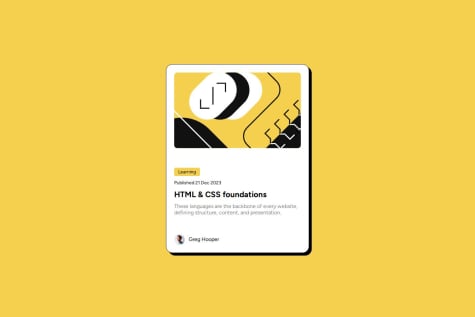
Hey, My website also came out a little wider than I wanted. The only thing I can point to that is actually really different is the space between the top image and the Learning box. I suggest removing all padding and margins at the start of the css and adding as needed. (At least thats what I did).
It was good experience coding.
The only suggestion I would say about the code is creating better class names as "center" wouldn't work in the long run.