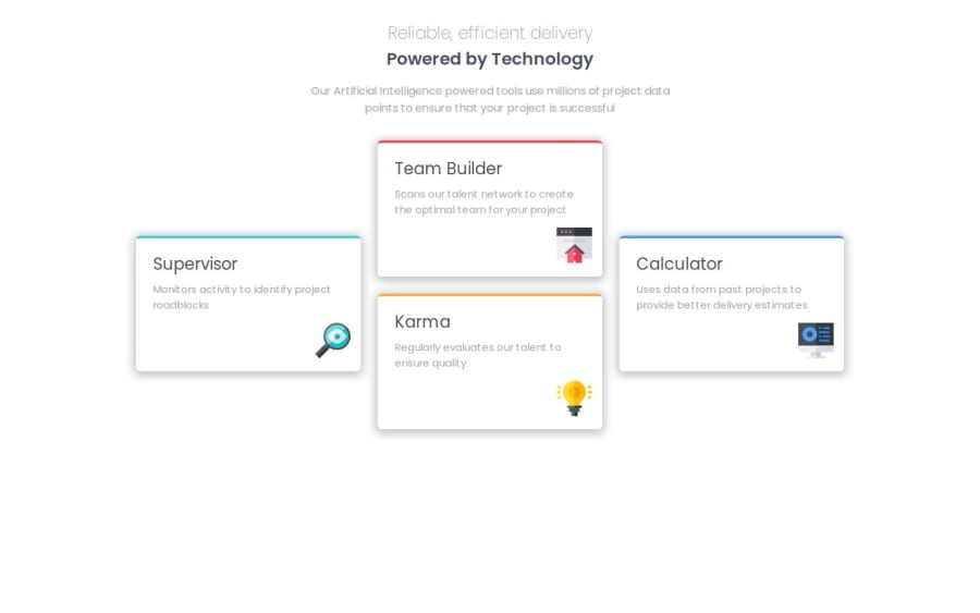


Design comparison

Solution retrospective
The completion of the project and the change to learn grid layouts despite this project not being the cleanest. A combination of grid and flexbox was used.
What challenges did you encounter, and how did you overcome them?My biggest challenge was with grid layout and trying to position the cards to be the same as the preview. There were times where I couldn't get the responsiveness to appear when the screen size changes, so I opted to use flexbox once the screen size was below 800px.
What specific areas of your project would you like help with?Any and all feedback is welcome.
Community feedback
- P@yoe7501Posted 12 months ago
I personally used a regular grid layout something like
grid-template-columns: repeat(auto-fit, minmax(325px, 1fr));and then when the screen became a bigger size fit for desktop I added the complexity to make the layout more like the preview with grid-template-areas.
0

Please log in to post a comment
Log in with GitHub
Join our Discord community
Join thousands of Frontend Mentor community members taking the challenges, sharing resources, helping each other, and chatting about all things front-end!
Join our Discord