Submitted 5 months ago
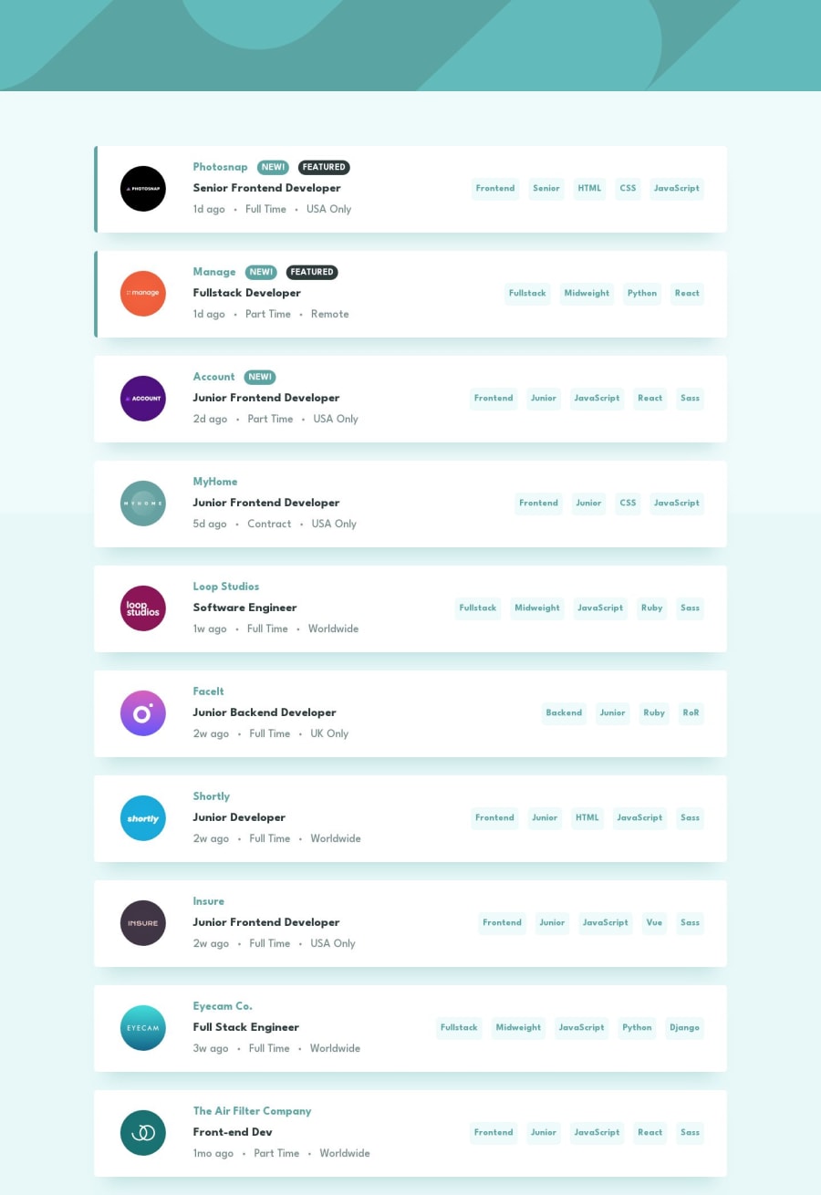
Job listings with filtering
#next#react#tailwind-css#typescript
@InnaTymoshenko
Design comparison
SolutionDesign
Community feedback
- P@yoe7501Posted 5 months ago
Hey the project looks great and pretty accurate. I like the filtering (better than mine I only did a one filter at a time) The only thing I would suggest for cleaner looking code is moving the tailwind into a css or scss file importing the css to the componenet and using the @apply
.button {
@apply rounded-lg bg-black text-white hover:bg-white hover:text-black
Marked as helpful0
Please log in to post a comment
Log in with GitHubJoin our Discord community
Join thousands of Frontend Mentor community members taking the challenges, sharing resources, helping each other, and chatting about all things front-end!
Join our Discord
