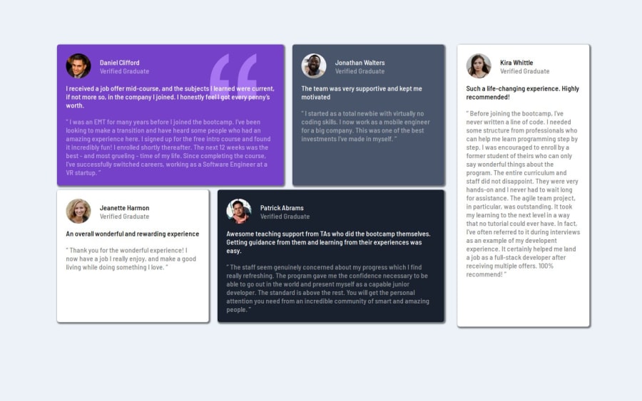


Design comparison

Community feedback
- P@yoe7501Posted 11 months ago
Hey congrats on completing this challenge. This one took a little bit to complete for me. On my screen the grids look really stretched out maybe adding a max-with to the whole container would help with that some thing like 900 px? not too sure. I also see that the kira whittle box is a little bigger than the rest compared to the solution. I would really recomment jumping in a trying to do this challenge with grid instead of flex box. Using grid area template also makes the whole challenge pretty easy. Last thing, changing the media query to switch to one card on top of the other should start a lot sooner maybe whenever it enters tablet sizes like 760-is pixels. Again, Good job :)
Marked as helpful0@ShadowKiD14Posted 11 months ago@yoe7501 Thank you for your feedback. I updated my code as you suggested. I am just starting out and haven't studied grids yet so I'm sticking with flexboxes for now, in future I will redo the challenge with grid. And I have fixed other things.
0

Please log in to post a comment
Log in with GitHub
Join our Discord community
Join thousands of Frontend Mentor community members taking the challenges, sharing resources, helping each other, and chatting about all things front-end!
Join our Discord