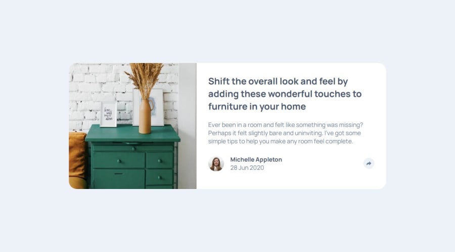
Design comparison
Solution retrospective
I'm proud of my approach to the share pop-up box including how I positioned it, the event listeners I used, and having the box be removed whenever a user clicks anywhere else on the document. Next time I would change the pop-up box's parent element as it ran me into a couple of problems. Namely it made positioning in the mobile version more tricky.
What challenges did you encounter, and how did you overcome them?I didn't encounter any major obstacles. But I hadn't done the "click anywhere" type of event listener before. I knew I needed to add an event listener to the entire document, and ChatGPT helped me with some of the logic.
What specific areas of your project would you like help with?If there any better techniques, specifically with the JS, I would love to hear suggestions.
Community feedback
- P@yoe7501Posted 11 months ago
I used an event listener on the share arrow button to toggle a class
const toggleButton = document.getElementbyId("share");
const buttonBox = document.querySelector(".buttonBox');

toggleButton.addEventListener('click', () =>{
buttonBox.classList.toggle('.active');
}
This toggle will allow the "active" css selector to be added onto the 'buttonBox' div and inherit whatever is there which in my case was simply a display: none; when clicked again it would go away. In the mobile view the share button popup isn't positioned currently positioning it absolutely and adding top: ; left: ; right: ; bottom: ; and playing with those values may help. Good job :)
Marked as helpful0
Please log in to post a comment
Log in with GitHubJoin our Discord community
Join thousands of Frontend Mentor community members taking the challenges, sharing resources, helping each other, and chatting about all things front-end!
Join our Discord
