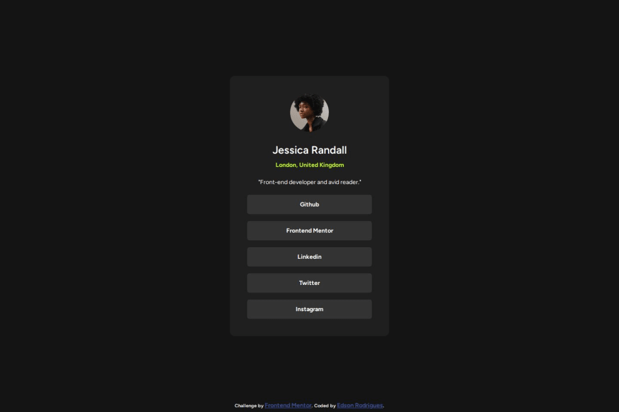
Social link profile main project using HTML and CSS
Design comparison
Solution retrospective
Organizing the content at the card, and maybe there is a more efficient way for styling the list of links.
What challenges did you encounter, and how did you overcome them?Making the clickable area of the links at the size of the list item. I changed the link display to block and set the height 100%.
What specific areas of your project would you like help with?A better use of "display".
Community feedback
- P@yoe7501Posted 5 months ago
Hey good job on the challenge just for some points to make it a little nicer.
body{
width: 100vw;
height: 100vh;
display: flex;
justify-content: center;
align-items: center;
should be good enough to center the div no need to create a main just a container for the whole card. Also for the link you can just create a div that contains the boxes
<div className='buttonBox'>
<button></button>
<button></button>
<button></button>
<button></button>
</div>

style.css
.buttonBox{
display:flex;
flex-direction:column;
.buttonBox{
background-color: blue //or whatever color for the hover affect
}
Make sure to play around with hover and focus affect. Also look into scss to help make css a little easier to use or maybe even tailwind when you get used to css :) good luck
Marked as helpful1
Please log in to post a comment
Log in with GitHubJoin our Discord community
Join thousands of Frontend Mentor community members taking the challenges, sharing resources, helping each other, and chatting about all things front-end!
Join our Discord
