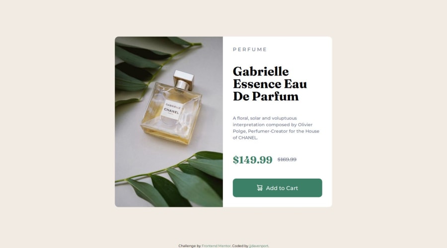
Product preview card using Grid container and Flexbox
Design comparison
Solution retrospective
The Layout and styling looks pretty good compared to the original. Next time I will build a mobile first layout to make it easier.
What challenges did you encounter, and how did you overcome them?I had difficulty making a flexible responsive layout on all devices.
What specific areas of your project would you like help with?Adjusting the layout so it works on all devices without overflow.
Community feedback
- P@yoe7501Posted 12 months ago
I liked this solution a lot I'm not sure how you got the description (right) side to go over the image little by little as the screen gets smaller but its looks really clean. I had mine kinda stay the same until it hit a certain width and immediently changed it to a mobile layout just cause I thought thats what the design asked for.
Marked as helpful1
Please log in to post a comment
Log in with GitHubJoin our Discord community
Join thousands of Frontend Mentor community members taking the challenges, sharing resources, helping each other, and chatting about all things front-end!
Join our Discord
