Design comparison
Solution retrospective
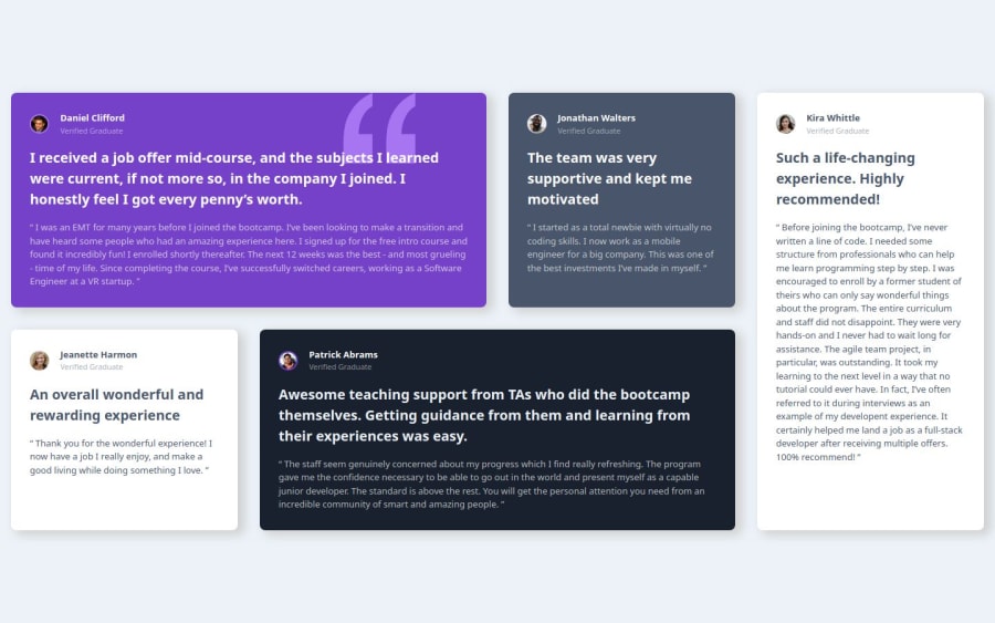
I feel like I am getting more comfortable with CSS grids!
What challenges did you encounter, and how did you overcome them?Nothing serious for this one. Aside from some positioning struggles here and there.
What specific areas of your project would you like help with?I tried using data attributes to dynamically (sort of) color my cards and paragraphs inside it. I was wondering if there's a clean way to right the css part without copy pasting it. Maybe some sort of mapping or something similar? If anybody can nudge me in the right direction that would be appreciated!
As always, feedbacks are much appreciated!
Community feedback
- P@yoe7501Posted 12 months ago
Hey, I went a very similar route with mine and honestly yours came out better. I liked that all the cells for the grid moved at the same time mine for some reason only the 5th box would move. The only thing I would say is maybe adding some padding to the wrapper as it looks a little too close to the rest of the screen in comparison to the solution.
0P@mickoymousePosted 12 months ago@yoe7501 Hello there! You are right! The padding seems a bit off! I will update them once I got back. Thank you!
0
Please log in to post a comment
Log in with GitHubJoin our Discord community
Join thousands of Frontend Mentor community members taking the challenges, sharing resources, helping each other, and chatting about all things front-end!
Join our Discord
