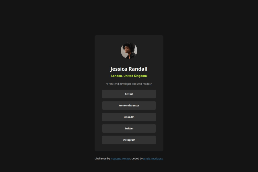
Social Links Profile with CSS native nesting and variable fonts
Design comparison
Solution retrospective
I'm proud of myself for being patient while going through this first project. I ended up pivoting with how I wrote some of my HTML or CSS, even though it probably would've been better had I outlined my thought process first before delving straight into HTML. In other words putting together some pseudocode even for HTML and CSS to figure out the structure of both, including what types of CSS classes I could use based on the BEM convention.
What challenges did you encounter, and how did you overcome them?The biggest challenges I faced were trying my hand at importing fonts differently than how I was used to, which was by using the @import at-rule and I would always use Google Fonts. I wanted to try to use the files provided within the project, but didn't have a lot of familiarity with the @font-face at-rule and during the first deployment, the fonts were not pulled in properly. I had to figure out the source of the error, and in the process I decided to try out variable fonts, as it was also new to me and I wanted to see if it a worthwhile solution.
Community feedback
- P@yoe7501Posted 11 months ago
Hey, I really liked this challenge I thought it was a good way to get my hands dirty and wasn't too difficult. The only thing I'd suggest is removing the media query as it wasn't too necessary. Also the HTML should be looked over not everything needs a class especially with smaller projects of which have just a handful of elements. It also in my opinon makes styling things a lot easier. Also just to throw it in there you should jump in and try to use SCSS :) I've really been liking the switch.
0 - @0xabdulkhaliqPosted 11 months ago
Hello there 👋. Congratulations on successfully completing the challenge! 🎉
- I have a suggestion regarding your code that I believe will be of great interest to you.
CSS 🎨:
- Looks like the component has not been centered properly. So let me explain, How you can easily center the component without using
margin.
- We don't need to use
marginto center the component both horizontally & vertically. Because usingmarginwill not dynamical centers our component at all states
- You already using
Flexboxfor layout, but you didn't utilized it's full potential. Just add the following rules to properly center the component.
body { align-items: center; }- Now remove these styles, after removing you can able to see the changes
body.app {
  margin: 50px 0;
}
main {
 margin: 0 auto;
}
- Now your component has been properly centered
.
I hope you find this helpful 😄 Above all, the solution you submitted is great !
Happy coding!
0
Please log in to post a comment
Log in with GitHubJoin our Discord community
Join thousands of Frontend Mentor community members taking the challenges, sharing resources, helping each other, and chatting about all things front-end!
Join our Discord
