P
@DanielleLenslySubmitted about 1 year ago

Hey @DanielleLensly, great job on completing your project! Some recommendations:
CSS:
rem instead of pxmax-width in rem on the main container andposition: absolute from main and position: fixed from attribution. You don’t even need static since that’s the defaultbody:body {
min-height: 100vh;
display: flex;
flex-direction: column;
align-items: center;
justify-content: center;
}
HTML:
a tags redirect users to another page/section of a site, which is what we need here. Instead of buttons which perform an action (ex. submitting information or hiding/showing divs)div class="main” can be replaced by <main>h1 (main heading) on a page. There’s no clear heading in the design, but you can add one with the sr-only class. Check out this article and here's another one for the headings.Hope this helps!
Hi @MeltedGreenVelvet, congrats on completing this challenge! A few suggestions:
header image
text image
.logo-container must be placed inside it and its contents not absolutely positioned to the body.<picture> tag instead of duplicating img depending on screen width.Housekeeping tips:
font-size: 16px can be deleted. Line 9 box-sizing: border-box is usually grouped together with the reset styles at the top.normal. No need to declare it each time unless you need to change value to italic or oblique.As far as pixel-perfection, it’s a myth :-) Instead, get as close as you can to the design while keeping your markup accessible. Check out this great article.
Hope this helps!
Hey @tbeagle2, congrats on submitting your project! Here are some recommendations.
CSS:
rems instead of px..mid-section of the project doesn’t look right on mobile screens up to 1305pxbodyAccessibility:
Apply for access should be an a tag since it links to another page. Avoid using ‘p’ tags for interactive elements.img tag vs pseudoelements. Example, the spirals are purely decorative and don’t really add anything meaningful to the document. Consider placing them as a :before or after pseudoelement.alt attribute. This text will be displayed if the image do not load. Example, logo-light doesn’t tell me anything, but WorkIt logo will tell me the meaning of the imageSections are a a better substitute to divs for related content on the page.General:
Hope this helps!
Nick!!! Good to see you here! The project looks great!
For your questions:
svgs for this instead of img tags. That way, you can manipulate the fill property depending on the pseudoclass.visibility: hidden, have you tried adding pointer-events: none to hamburgerContainer (which should be a button btw for accessibility)? I usually hide mobile menus with a combination of positioning, opacity, and then adjusting top/left/right depending on the design. This approach makes transitions possible.nav tag as a parent for Header contents, instead of nesting another div.Learn More is most likely a link.Sunnyside logo, and the client images alt=“Jennie” for the Jennie block.h2 is more appropriate. Use CSS classes to change text appearance.Hope this helps and lmk if anything!
Hi @MelakuAlehegn, congrats on completing your project! The toggle code works well. You can use a library such as Slick or Swiper.js to create the slider for the cards. You can even write your own code using vanilla js.
A few other things I noticed:
nav-links needs an a tag nested inside the lisbuttonSection tags could be used for major parts of the page instead of divsalt tags. On the nav logo for example, I would name it 'Manage logo'Hope this helps!
Hey @MarwanHassan22, looks like you have a typo on line 7 of your html file that's preventing your styles to load. Removing the slash before dist should do it.
I also recommend restructuring your HTML to keep it semantic. Here's a good reference on how to do it.
Hope this helps!
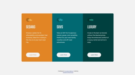
Hi Hendrick, looks great! Another way to do the hover state for the button is to add the white border from the get-go, and then just changing the background color + font color on hover.
For your html, h1 should only be used once per page. I would use h2 for the car types and one h1 for the page with a sr-only class to keep the page accessible. You can read about it here.
The platform has a lot of resources on CSS grid that should help you out with your future challenges. Grid Garden seems to be popular.
Hope this helps!
Hi @SecreSwalowtail, great job here! Looks very close to the design.
A few things I noticed that could be improved:
Repetition of elements - there are two versions of the storage indicators (white box), one for mobile and desktop. It also results in repetitive CSS -- lines 179-190 are the same as 255-267. I would try absolute positioning using only one of these elements to achieve the responsive layout.
Don't choose headings based on how large the text look in the design. h1 is a page-level heading and shouldn't be used for the number in 185 gb left. I would refactor to
<p><span>185</span>gb left</p>
The background image gets cut off after 1440px. Change the background-size to 100% 50%
The buttons inside the first container should also be using the <button> tag. In a real app, they would likely be used for revealing a modal to upload different types of files.
Hope this helps!
Hi Robert, for your img fallback question, correct me if I'm wrong, but I think the <img srcset> isn't equipped to handle image changes. Quoting the spec definition on your article reference: "<img srcset="" sizes="" alt=""> is for serving differently-sized versions of the same image". The desktop and mobile versions look very different, and to me it looks like they fall under 'art direction'. Again, I'm taking a stab at the question and would also very much appreciate if anyone can validate.
Project looks awesome as expected :-)
Hey @omerkhan7210, the trick here is to push the svg to the top of the page with background-position: top center and then giving the body background-color: var(--color-1).
Other tips:
h1. Don't choose a heading tag based on how large the text appears in the design. Use classes to style the headings instead. Here's a resourcea or button tag since it is an interactive elementbackground-size: coverHope this helps!
@hebrerillo seems better, yes. It's best-practice, however, not to skip heading levels as stated in the resource I mentioned above. You can reuse the heading tag once it's been mentioned once, in order.
For example, in the technologies page, you have h1> h4 > h3. The numbers are not in order. Ideally, it would be h1> h2 > h3. You can then reuse h2 and h3 elsewhere in the page as long as it has been mentioned in order once, ex. h1> h2 > h3 > h2 > h3 > h2. This semantic is common in designs that have multiple sections, since each of the sections will usually need the same headings.
Another side note about the h1 on the homepage. I would keep the entire phrase 'SO, YOU WANT TO TRAVEL TO SPACE' in one h1 tag. I would write it as
<h1>SO, YOU WANT TO TRAVEL TO <span>SPACE</span></h1>.
Hope this helps!
Hey @hebrerillo, this looks visually solid, congrats!
The only thing that I noticed is the use of semantics, especially headings, on each page. We're missing the h1s here and the heading levels doesn't seem to be in order (ex. h5 is mentioned first before h2). Use classes to style your headings (or anything for that matter), instead of looking at 'how large' they look on the design and assigning a heading tag. Here's a resource regarding the headings.
Hope this helps!
Hey @stephjoseph, looks awesome! The only two things that I noticed is that
buttons not divs, since they are interactive componentsHope this helps!
Hey James, nice job! Have you tried object-fit: contain to control the stretch of the images?
A few other things I noticed:
h1a tags or buttons instead of divsHope this helps!
Hey Petru, good work here. For your question, I don't see a nav for this particular design, so I'm assuming the issue is setting an explicit height for the mobile view. If you remove the heights set for main_container and testimonials, the content will naturally stack, just like the mobile design.
A few more thoughts:
height and width styles for the html and body. You don't need them for this particular design. Let the content dictate the dimensions of the project.main_container doesn't need a huge margin around it. Center the element with margin-inline: auto. It also doesn't need grid. It's children are div and section - both are display: block by default (will span the entire row) and will therefore stack.There's a bit more to unpack here but I think more practice with flexbox and grid will help you improve on your next project. Hope this helps! :-)
Hi Mark, looks good! Email validation works great. I might just play with the background position in this case, something like background-position: top, left bottom -1px;. Some buttons could've been <a> tags, but that's my opinion. Hope this helps!
Hey @abhikr4545, looks good, congrats! Solving the issue with the background would involve removing overflow: hidden to the parent section, and then adding a higher z-index to the nav as follows:
position: relative;
    z-index: 1;
    background-color: white;
Just a couple more thoughts:
<a> tagsHope this helps!
Hey Anna! 👋🏼 Just wanted to say welcome back! Looks awesome as always and I love the subtle animations that just fits. The only suggestion I have is to center the content on much larger screens, say 1920x1080. Inspired me to do another project 🙂