Hi there 🙋🏻♀️ I’m an experienced Frontend Developer specializing on translating designs into HTML/CSS. I've worked with a number of technologies including React, NextJs, Javascript, Ruby on Rails, SCSS, BEM, Sketch, and Figma.
I’m currently learning...React • Nextjs • a11y
Latest solutions
Arch Studio multi-page site with Next.js, GSAP, and Contentful CMS
#contentful#gsap#next#typescriptSubmitted 2 months agoPlanets site with Next.js and styled components
#accessibility#styled-components#nextSubmitted over 3 years ago
Latest comments
- P@DanielleLenslySubmitted about 1 year ago@emestabilloPosted about 1 year ago
Hey @DanielleLensly, great job on completing your project! Some recommendations:
CSS:
- add a reset to your stylesheet
- use relative units such as
rem
instead ofpx
- lines 116 and 122 are identical as mentioned previously. So are lines 80 and 141.
- For the width of the cards:
- set a
max-width
inrem
on the main container and - remove all widths and max-widths on the cards. Use padding to keep the content from touching the gutter
- set a
- For centering the component on the page:
- Remove
position: absolute
from main andposition: fixed
fromattribution
. You don’t even needstatic
since that’s the default - use flex (or grid) on the
body
:
- Remove
body { min-height: 100vh; display: flex; flex-direction: column; align-items: center; justify-content: center; }
HTML:
a
tags redirect users to another page/section of a site, which is what we need here. Instead ofbutton
s which perform an action (ex. submitting information or hiding/showing divs)div class="main”
can be replaced by<main>
- Write your markup as if you are writing a word document. There should only be one
h1
(main heading) on a page. There’s no clear heading in the design, but you can add one with thesr-only
class. Check out this article and here's another one for the headings.
Hope this helps!
1 - P@MeltedGreenVelvetSubmitted about 1 year ago@emestabilloPosted about 1 year ago
Hi @MeltedGreenVelvet, congrats on completing this challenge! A few suggestions:
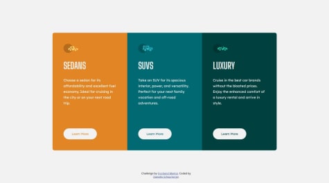
- The challenge has 3 major parts: header, image, text with form. On mobile, they will naturally stack (no need for flex). On desktop, use grid. You can create a 2 column grid with template areas:
header image text image
- Why is the header tag empty?
.logo-container
must be placed inside it and its contents not absolutely positioned to the body. - There’s a duplicate link that goes to the homepage inside the logo-container
- For the logo - Alt text are not used by svgs. Better to use the img tag and the logo as src, with proper alt text ‘Base Apparel logo’ or ‘Base Apparel | Home’.
- For the woman image, look into the
<picture>
tag instead of duplicatingimg
depending on screen width. - Avoid hardcoding height and width. It can lead to content overflow or elements getting cut off
- JS: For every incorrect email entry, the document adds another error icon. Once the user input passes validation, only the last error icon is removed.
Housekeeping tips:
- Default font sizing for browsers is 16px. Line 8
font-size: 16px
can be deleted. Line 9box-sizing: border-box
is usually grouped together with the reset styles at the top. - The default value for font-style is
normal
. No need to declare it each time unless you need to change value to italic or oblique. - Avoid nesting selectors to keep specificity low. Nest your selectors only when needed (usually it’s done to override a style declared previously). Keep them all at one level if possible.
As far as pixel-perfection, it’s a myth :-) Instead, get as close as you can to the design while keeping your markup accessible. Check out this great article.
Hope this helps!
Marked as helpful1 - @Jalex-McSubmitted about 1 year ago@emestabilloPosted about 1 year ago
Hey @tbeagle2, congrats on submitting your project! Here are some recommendations.
CSS:
- Add a CSS reset before your custom styles
- Use mobile-first approach. Easier to scale up elements rather than making large items fit small screens.
- Use relative units such as
rem
s instead of px. - Avoid hardcoding width and height as much as possible. It usually leads to overflows or content getting cut off. The
.mid-section
of the project doesn’t look right on mobile screens up to 1305px - Position the spirals absolutely to their nearest container. Right now, all of them are against the
body
- There’s no space between the footer logos and the end of the page
Accessibility:
Apply for access
should be ana
tag since it links to another page. Avoid using ‘p’ tags for interactive elements.- Social logos are also meant to bring the user to another page.
- Look into the use of the
img
tag vs pseudoelements. Example, the spirals are purely decorative and don’t really add anything meaningful to the document. Consider placing them as a:before
orafter
pseudoelement. - Use more descriptive terms for the
alt
attribute. This text will be displayed if the image do not load. Example,logo-light
doesn’t tell me anything, butWorkIt logo
will tell me the meaning of the image Section
s are a a better substitute to divs for related content on the page.
General:
- Use one repo per project. A monorepo for all the challenges can get complicated very quickly.
- Check out Kevin Powell's videos on YT as a resource for responsive layouts.
- While you’re learning, focus on the quality of the output - the translation of design, accessibility, best practices, etc. - rather than timing yourself. Speed comes naturally later when you’ve had a number of projects under your belt.
Hope this helps!
Marked as helpful2 - @nickcarlisiSubmitted over 1 year ago@emestabilloPosted over 1 year ago
Nick!!! Good to see you here! The project looks great!
For your questions:
- Social logos - I would use
svg
s for this instead of img tags. That way, you can manipulate the fill property depending on the pseudoclass. - Mobile menu - When using
visibility: hidden
, have you tried addingpointer-events: none
to hamburgerContainer (which should be a button btw for accessibility)? I usually hide mobile menus with a combination of positioning, opacity, and then adjusting top/left/right depending on the design. This approach makes transitions possible. - I see your point about the images 😄. Maybe I’ll have @mattstudert weigh in. My two cents is that a well-written readme with good UI and accessibility will often turn heads than the images in your project.
- A few more things:
- Use one menu for both mobile and desktop, and adjust their UI with CSS. It’s best for accessibility and maintenance.
- You could use the
nav
tag as a parent forHeader
contents, instead of nesting another div. Learn More
is most likely a link.- Images could use a more descriptive alt tag. The logo for example, could have
Sunnyside logo
, and the client imagesalt=“Jennie”
for the Jennie block. - Client Testimonials is a section heading, so
h2
is more appropriate. Use CSS classes to change text appearance.
Hope this helps and lmk if anything!
Marked as helpful1 - Social logos - I would use
- @MelakuAlehegnSubmitted almost 2 years ago@emestabilloPosted almost 2 years ago
Hi @MelakuAlehegn, congrats on completing your project! The toggle code works well. You can use a library such as Slick or Swiper.js to create the slider for the cards. You can even write your own code using vanilla js.
A few other things I noticed:
- The page looks squished at 769px. The nav and the footer look particularly off at this breakpoint. I recommend increasing it to at least 1090px.
- The
nav-links
needs ana
tag nested inside theli
s - The hamburger toggle should be a
button
Section
tags could be used for major parts of the page instead ofdiv
s- Use a more descriptive value for the
alt
tags. On the nav logo for example, I would name it 'Manage logo' - On mobile, the nav links container needs centering. So does the the footer logos.
- Add transitions to your hover states
Hope this helps!
Marked as helpful1 - @MarwanHassan22Submitted almost 2 years ago@emestabilloPosted almost 2 years ago
Hey @MarwanHassan22, looks like you have a typo on line 7 of your html file that's preventing your styles to load. Removing the slash before
dist
should do it. I also recommend restructuring your HTML to keep it semantic. Here's a good reference on how to do it.Hope this helps!
0