React and Next.js 13.4 landing page using sass, grid and flex


Design comparison

Solution retrospective
As always, any tips, recommendations or suggestions are welcome. A few things...
-
Not sure how to change the color of svgs on hover for the footer social logos. I tried a few things, but nothing seems to be working. Any tips?
-
For the mobile menu, I have the initial state set to display:none and then on click I change it to display:block. The problem is that I want to add transitions such as opacity and scale, but to my knowledge we're still unable to add a transition to display, which negates the other transitions. I tried making it visibility: hidden, instead of display:none, but the problem there is that the menu is covering the clickable elements below and they become unable to click.
-
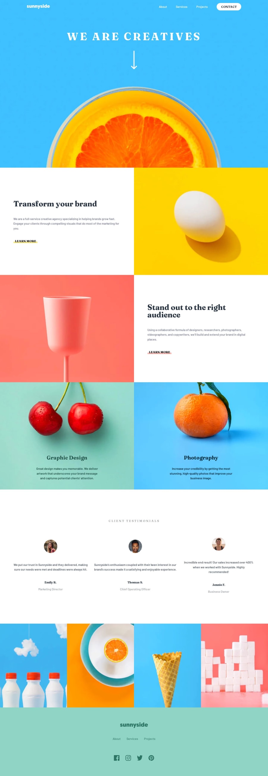
Random, but is it just me or does it seem like the images that we're provided with for these projects are low quality? I know we don't want to use large file sizes for web, but they seem to be particularly small and therefor blurry on larger screen sizes. I just feel if you're adding a project to your portfolio and the images look blurry, it's going to look bad to the user/viewer. This project in particular has copy on it that says, "Increase your credibility by getting the most stunning, high-quality photos that improve your business image", but the images on the actual site are low-quality.
Community feedback
- @emestabilloPosted over 1 year ago
Nick!!! Good to see you here! The project looks great!
For your questions:
- Social logos - I would use
svgs for this instead of img tags. That way, you can manipulate the fill property depending on the pseudoclass. - Mobile menu - When using
visibility: hidden, have you tried addingpointer-events: noneto hamburgerContainer (which should be a button btw for accessibility)? I usually hide mobile menus with a combination of positioning, opacity, and then adjusting top/left/right depending on the design. This approach makes transitions possible. - I see your point about the images 😄. Maybe I’ll have @mattstudert weigh in. My two cents is that a well-written readme with good UI and accessibility will often turn heads than the images in your project.
- A few more things:
- Use one menu for both mobile and desktop, and adjust their UI with CSS. It’s best for accessibility and maintenance.
- You could use the
navtag as a parent forHeadercontents, instead of nesting another div. Learn Moreis most likely a link.- Images could use a more descriptive alt tag. The logo for example, could have
Sunnyside logo, and the client imagesalt=“Jennie”for the Jennie block. - Client Testimonials is a section heading, so
h2is more appropriate. Use CSS classes to change text appearance.
Hope this helps and lmk if anything!
Marked as helpful1@nickcarlisiPosted over 1 year ago@emestabillo,
Hey Em, I thought I might run into you here! 😄 Thanks for the feedback. I did this one fairly quickly. I've been working on a bigger FEM project (Scoot), but it's been taking longer than anticipated (as is often the case) and I just wanted to have something new to throw on the portfolio. Ironically, I've built close to a dozen full sites over the last year and a half, but due to copyright issues, I don't think I can use them for my personal portfolio.
-
I'll try using svg instead of image for the social links. I feel like I've done this in the past actually, using font awesome icons, but that was a while ago.
-
I think I did try using 'pointer-events: none' for the mobile menu, but it still seemed to block the clickable elements below. Generally, with a mobile menu, yeah, I would have it positioned off screen when it's closed, but in this case with the design, it seemed like it should just pop up like a modal. I suppose if I move it off screen and then back on with no transition, by the time the transitions (opacity, etc.) take place, the menu will already be in place. I know I've done this kind of thing before. I'll just need to look back at some previous projects to refresh my memory.
-
I'll go through your other comments as well. Some, such as the 'learn more' link and alt tags, were probably due to me rushing a bit.
-
Admittedly, I tend to ignore the readme, which I realize is a no-no. I guess, I just find the actual coding more fun than writing about it, but I need to remedy that.
Thanks again and hope you're well!
1@emestabilloPosted over 1 year ago@nickcarlisi Yeah, wish we could see what you've been up to with the bigger sites....I've seen your work on production, so I know it's 👌.
I've been working on the same project...and just like you, finishing it and not getting distracted is another story lol. I'll be on the lookout for your next one! 👀 Hope you're doing great as well!
Marked as helpful0 - Social logos - I would use

Please log in to post a comment
Log in with GitHubJoin our Discord community
Join thousands of Frontend Mentor community members taking the challenges, sharing resources, helping each other, and chatting about all things front-end!
Join our Discord