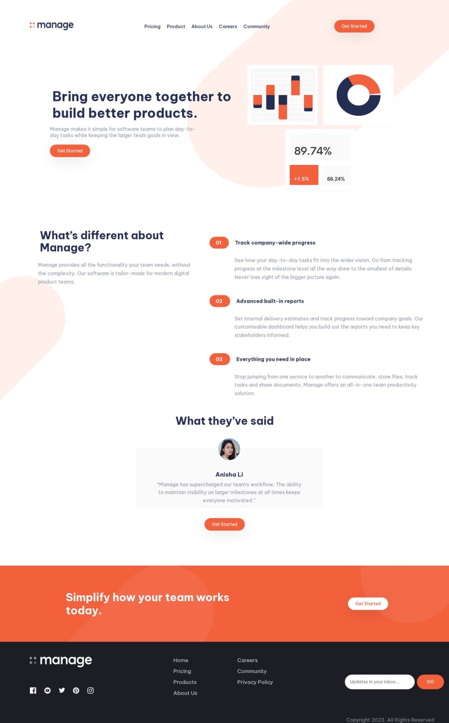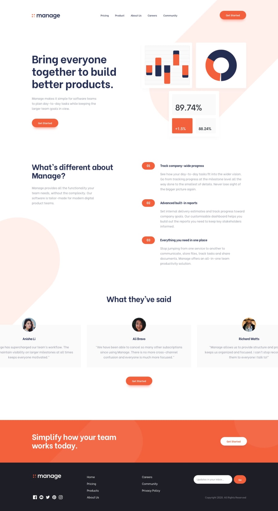
Manage Landing page with mobile menu
Design comparison
Solution retrospective
I was able to make the mobile menu using javascript, but I couldn't come up with a way to add the scroll behavior on the cards section. Any suggestions on that is appreciated. Thanks
Community feedback
- @emestabilloPosted almost 2 years ago
Hi @MelakuAlehegn, congrats on completing your project! The toggle code works well. You can use a library such as Slick or Swiper.js to create the slider for the cards. You can even write your own code using vanilla js.
A few other things I noticed:
- The page looks squished at 769px. The nav and the footer look particularly off at this breakpoint. I recommend increasing it to at least 1090px.
- The
nav-linksneeds anatag nested inside thelis - The hamburger toggle should be a
button Sectiontags could be used for major parts of the page instead ofdivs- Use a more descriptive value for the
alttags. On the nav logo for example, I would name it 'Manage logo' - On mobile, the nav links container needs centering. So does the the footer logos.
- Add transitions to your hover states
Hope this helps!
Marked as helpful1@MelakuAlehegnPosted almost 2 years agoHeyy @emestabillo, This has to be the most useful comment I got on frontend mentor. Thanks for taking your time to review this all. I tried to address most of them. Appreciate it.
1 - @xsova113Posted almost 2 years ago
Use "overflow-x: scroll" in css for the testimonial section should be able to get the card scrollable horizontally. also flex-direction should be row.
Try it out and lemme know if it works.
1@MelakuAlehegnPosted almost 2 years agoHeyy @xsova113 I have used this and didn't work.
0@xsova113Posted almost 2 years agohi, @MelakuAlehegn, I downloaded your repo and i got it working. Heres the code:
.testimonial {
display: flex;
flex-direction: column;
align-items: center;
margin-top: 4rem;
overflow-x:scroll ;     <---------- add this line in your testimonial class
}
lemme know if you can get it working.
0@xsova113Posted almost 2 years ago@MelakuAlehegn Theres a tiny problem though, currently when you scroll you will notice that only 3 cards showing up rather than 4.
To fix this, just add a margin left and right sets to "auto" in the class testimonial-cards like so:
.testimonial-cards {
display: flex;
margin-left: auto;
margin-right: auto;
}
hope it helps.
0
Please log in to post a comment
Log in with GitHubJoin our Discord community
Join thousands of Frontend Mentor community members taking the challenges, sharing resources, helping each other, and chatting about all things front-end!
Join our Discord
