Design comparison
Solution retrospective
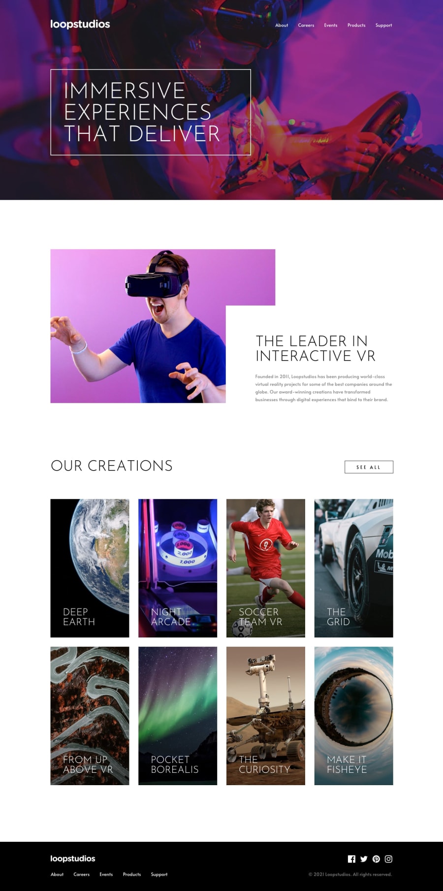
Hi everyone, thought I'd give this fun challenge a go. I've noticed that the screenshot mirrors the project in Firefox compared to Chrome. I've had to make adjustments to keep them acceptable on both, aside from the prefixes. I also can't get my .container class to be as wide as it's supposed to be. It's identical to the design files in width, but it's a few pixels off when superimposed to the design. I can live with the results though :-)
My questions are mostly related to accessibility. What is the best way to deal with the base font size? I've been using the 62.5% route, since that was the advice given to me before. I've been reading up on it recently, and it was mixed opinions. So for this project, I reverted to setting it on html as px. Should I have placed a percentage value instead? Do I put it on body or html? Or should I stick to 62.5%? Looking for the standard and more accessible option.
Also, I'm not keen on major animations but I tried some here using a library to spiff up UX. At what point/how does it negatively affect accessibility?
Thanks and looking forward to your comments!
Community feedback
- @ApplePieGiraffePosted almost 4 years ago
Hello, Emmilie Estabillo! 👋
I'm so happy to see you complete another challenge! 😀 Amazing job on this one! 🙌
I love the animations you added to all of the interactive elements of the page! 🤩 Everything else looks great and responds very nicely! 👏
I'm a huge fan of animations (and I'd like to add even more to my solutions). I'm no accessibility expert, of course, but if you're not already aware of it, I've heard there's a media query called
prefers-reduced-motionthat allows you to, like, disable animations if a user has set their system preferences to reduce motion. Check it out.Also, IMHO, I believe setting the base font-size to a percentage value is still a good idea to allow users to control the size of text on a website (although I've heard some advice to not change the browser's default font-size and simply work with
remsbeing the default16pxor whatever). But, IDK, I'll do some more research, too, I guess! 😅Of course, as always—keep coding (and happy coding, too)! 😁
1@emestabilloPosted almost 4 years ago@ApplePieGiraffe Hey APG! I'm also happy to complete it. I suppose I come out with one every 2 months 😄
Thanks for sending the link! I'll definitely consider the media query for future works. I like AOS, it was really easy to use. I actually admire all the animations you put it your projects. Once I get comfortable with accessibility...I'm not ashamed to say - I will copy them! 😂😂😂
My opinion about base font is the same. I like working with percentages and rems. 62.5% is particularly easier to develop with and I wouldn't need a calculator on hand. I'd be willing to refactor if there's a better accessibility measure though.
Thank you as always for all your insights!!
1 - @abhik-bPosted almost 4 years ago
Hi Emmilie 👋 , Just came here to say your solution seems PERFECT to me 💯💯👏👏, it is very responsive , and accessibility seems great to me , Animations are cool 😎👌
Happy Coding 😇 & Please keep contributing these EXCELLENT solutions 🚀
1@emestabilloPosted almost 4 years ago@abhik-b Thank you Abhik! Glad you liked it :-)
1
Please log in to post a comment
Log in with GitHubJoin our Discord community
Join thousands of Frontend Mentor community members taking the challenges, sharing resources, helping each other, and chatting about all things front-end!
Join our Discord
