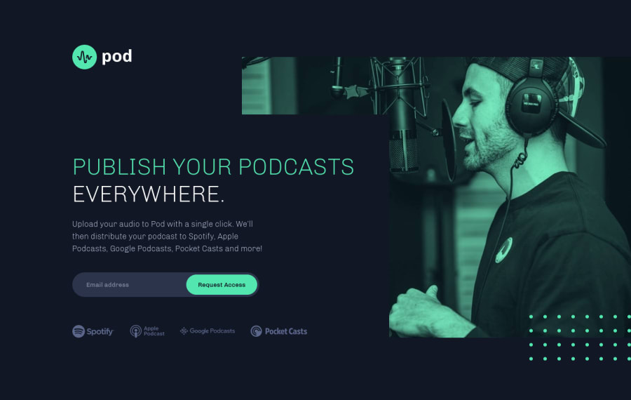
Pod Request Access Landing Page - CSS Animations, JS
Design comparison
Solution retrospective
Hi, everyone! It has definitely been a minute, but after a very long coding break I'm back! š I'm excited to be submitting my first premium challenge solution as a Pro member. Having the design files has been a massive time saver! š
Since it's been so long, I decided to stick with plain, old CSS and JS for this project - bit of a "warm up". š
While the project was pretty straightforward, I did run into a rather odd bug. In Safari, I noticed the podcast svgs were blurry. After some testing, it seems that svgs that have a filter and are also in an img tag are blurred. If the filtered svgs are inline, they display just fine. The only suggestions I found online were to add -webkit-transform: translate3d(0,0,0
) or -webkit-filter: blur(0px);
. Unfortunately, neither worked in this case.
Since the grey filter on the podcast svgs in the starter code didn't quite match the color in the design files anyway, I ended up editing the svg files directly to remove the filter and manually change the color to match the design. However, if anyone has a simpler solution to the Safari svg blurring issue, please let me know! Have any of you ever encountered it before?
Community feedback
- @grace-snowPosted almost 3 years ago
Just a few small suggestions from me
- I think those logos are valuable content. This is a sign up page trying to convince visitors the product is good, so I would preceded these with an Sr only heading and give all of them alt descriptions
- you need to have aria-live attributes on those error and success messages so they get announced when displayed
- you need to have aria-desciribedby on the input pointing to the id of the error message so they are associated to each other
I hope this helps
Marked as helpful5@brasspetalsPosted almost 3 years ago@grace-snow Thank you for taking the time to look at my solution! š Accessibility is definitely not my strong suit (yet!), so I always appreciate your suggestions. I've just updated my solution, hopefully implementing them correctly. š¤
1 - @emestabilloPosted almost 3 years ago
Hey Anna! šš¼ Just wanted to say welcome back! Looks awesome as always and I love the subtle animations that just fits. The only suggestion I have is to center the content on much larger screens, say 1920x1080. Inspired me to do another project š
Marked as helpful2@brasspetalsPosted almost 3 years ago@emestabillo Hi, Em! Great catch! While technically "centered", the pseudo elements ignore padding, and so visually it was defintely off. š¤¦āāļø My bad. Should be fixed now. š Thanks!
Oooh! Looking forward to seeing your next one! š
2 - @ApplePieGiraffePosted almost 3 years ago
ANNA
We've already talked about your project a bit, but I thought I'd leave a comment here! š
I didn't expect to find anything to suggest (at least, as far as the design of your solution goes), and I'm glad I was right! š
The intro animation is subtle and not distracting (like you wanted), and SVGs look sharp to me (so... glad you figured that one out)!
Um... looking forward to the rest of the solutions that you have planned! I'm really happy you're back, as well! š„³
And, of course, keep coding (and happy coding, too)! š
3@brasspetalsPosted almost 3 years ago@ApplePieGiraffe Thanks, APG! It's good to be back. š
1@ApplePieGiraffePosted over 2 years ago@brasspetals
Add
overflow-x: hidden
.Marked as helpful1 - @BurritoDoggiePosted almost 3 years ago
Hey Anna!!
I love it when people like you take on big projects and make them look great! It looks amazing and I would love to see more projects from you!!
Keep Coding! :)
2@brasspetalsPosted almost 3 years ago@BurritoDoggie Hi, Alyssa! š Thanks for taking the time to look at my solution and leave such kind feedback. š
2 - @MarcusTuliusCiceronPosted almost 3 years ago
Your pixel perfect on this one congrats, I wish I could do as good as you are doing, good luck for your next challenges :D
2@brasspetalsPosted almost 3 years ago@MarcusTuliusCiceron Thanks! š Just took a quick look at your profile, and at the rate you're going I'm sure you'll surpass me in no time! š
2@MarcusTuliusCiceronPosted almost 3 years ago@brasspetals I still need lot of practice :D I'm currently doing the loopside studios challenge and trying to reuse some of your animation techniques to make it look nice on page loading. I hope it will turn good :D
0@brasspetalsPosted almost 3 years ago@MarcusTuliusCiceron The loopstudios page was definitely my favorite of the challenges I've done so far. I hope you enjoy it too. Feel free to poke through my code all you like, I just hope it's not too much of a mess. š Looking forward to seeing your solution! I'm sure it'll be great. š
0 - @jomefavouritePosted over 2 years ago
Hello Anna!
I really love how you take your time to make the layouts of each project you've done pixel-perfect, and also add really smooth animations. I wish I spent more time on animations š
Welcome back to coding!
1@brasspetalsPosted over 2 years ago@jomefavourite Thank you so much - it's good to be back! š Animations can be tricky, but worth the effort...usually. š
0
Please log in to post a comment
Log in with GitHubJoin our Discord community
Join thousands of Frontend Mentor community members taking the challenges, sharing resources, helping each other, and chatting about all things front-end!
Join our Discord