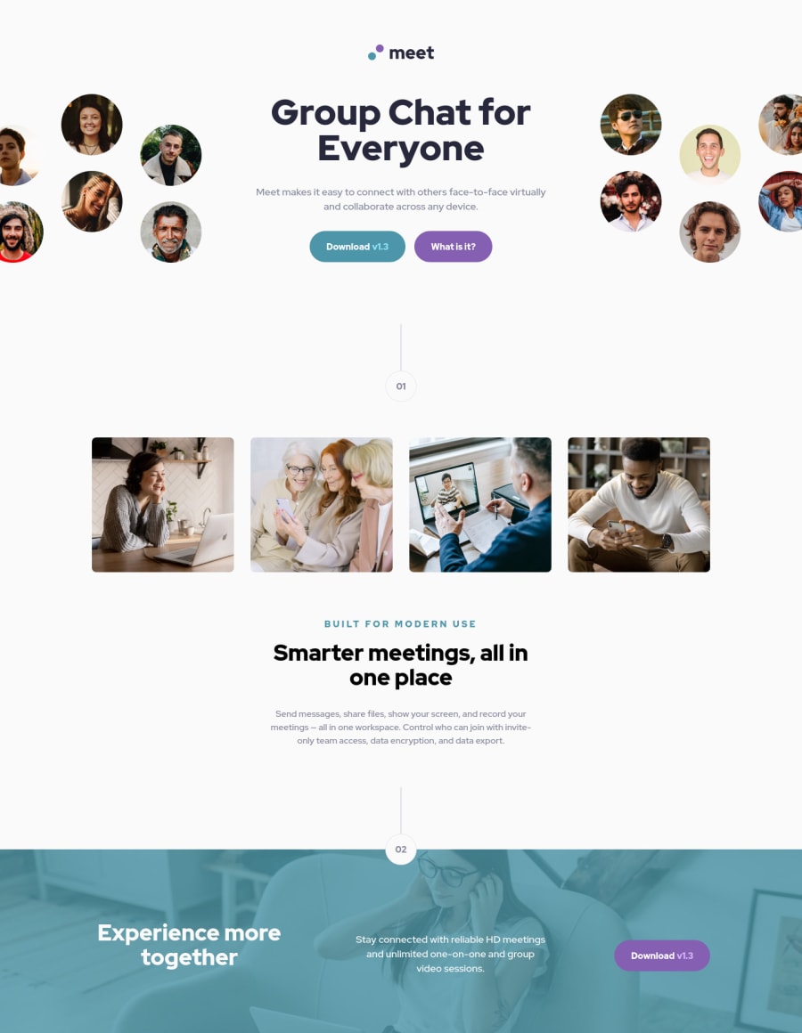
Meet Landing Page with ReactJs and TailwindCSS


Design comparison

Solution retrospective
I tried to make it responsive according to the Figma file, but when I go for a smaller size for laptop size, it breaks (the picture especially). How do you manage the image used in the hero so that they can adjust according to the resizing?
Community feedback
- @emestabilloPosted over 2 years ago
Hey James, nice job! Have you tried
object-fit: containto control the stretch of the images?A few other things I noticed:
- The document is missing its top level heading. The large header text should be an
h1 - Interactive elements should be
atags orbuttonsinstead of divs - I personally would increase the breakpoint for desktop. The 'What is it' button and the 4 images in the next section look like they're breaking layout at 1024px.
- The footer text should be left-aligned on desktop.
Hope this helps!
0@jte0711Posted over 2 years agoHi @emestabillo ! I haven't tried that yet, honestly didn't even know about that style prop before.
Thanks for all the feedback, totally missed them if you didn't tell me. For the header text, does it really need to be
h1? Wouldn't it be fine as long as the styling make it looks the same as the design?0@emestabilloPosted over 2 years ago@jte0711 I highly recommend looking into semantic html for accessibility, especially if you want to set yourself apart from others in the field. You want to make your sites usable by everyone, including people with disabilities. There's tons of resources - here's one and this might also persuade you to reconsider.
0 - The document is missing its top level heading. The large header text should be an

Please log in to post a comment
Log in with GitHub
Join our Discord community
Join thousands of Frontend Mentor community members taking the challenges, sharing resources, helping each other, and chatting about all things front-end!
Join our Discord