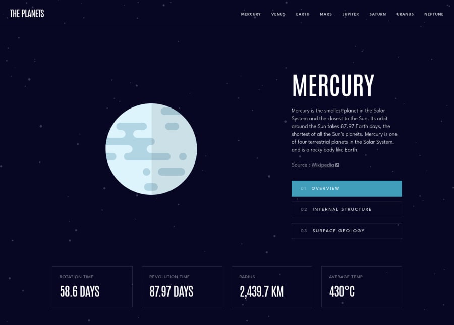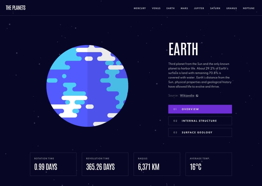
Design comparison
Solution retrospective
Hey everyone!
I just completed another challenge. 🤘🏽
In this challenge I decided to use Vanilla CSS for styling using BEM methodology just so I can practice CSS fundamentals. I also used Next.js as React framework.
To generate dynamic routes/pages I used the built in getStaticProps() and getStaticPaths() functions and used the provided data.json file as basis.
I also then used GSAP for animation as elements' animations are highly dependent on the changing of states rather than the rendering of each component.
Feedback is always welcome. Please let me know of any issues you may find and/or how I can improve my code :)
Happy coding!
Community feedback
Please log in to post a comment
Log in with GitHubJoin our Discord community
Join thousands of Frontend Mentor community members taking the challenges, sharing resources, helping each other, and chatting about all things front-end!
Join our Discord
