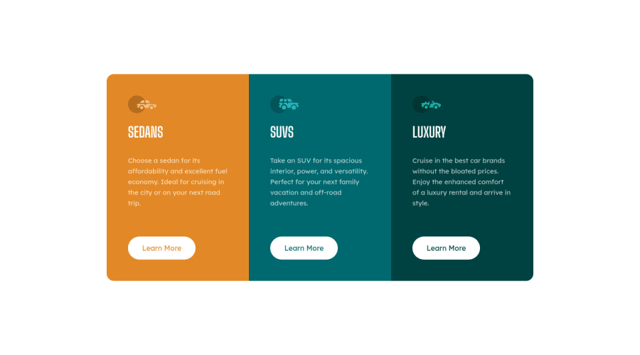
3-column preview Card Component Solution
Design comparison
Solution retrospective
I used a mobile-first design approach for this challenge.
Adding a border to the "learn more" button hover state without pushing other elements was quite interesting.
I rely a lot on display: flex to lay out my content - I am looking to use grids for future challenges (if anyone has a good instructional resource that they can share, that would be awesome!).
Community feedback
- @emestabilloPosted about 2 years ago
Hi Hendrick, looks great! Another way to do the hover state for the button is to add the white border from the get-go, and then just changing the background color + font color on hover.
For your html,
h1should only be used once per page. I would useh2for the car types and one h1 for the page with asr-onlyclass to keep the page accessible. You can read about it here.The platform has a lot of resources on CSS grid that should help you out with your future challenges. Grid Garden seems to be popular.
Hope this helps!
Marked as helpful1@hendrickmanullangPosted about 2 years ago@emestabillo thank you! Semantic HTML & accessibility is something I need to work on - I'll keep this in mind!
1
Please log in to post a comment
Log in with GitHubJoin our Discord community
Join thousands of Frontend Mentor community members taking the challenges, sharing resources, helping each other, and chatting about all things front-end!
Join our Discord
