easybanking-frontend-mentor using tailwind and react
Design comparison
Solution retrospective
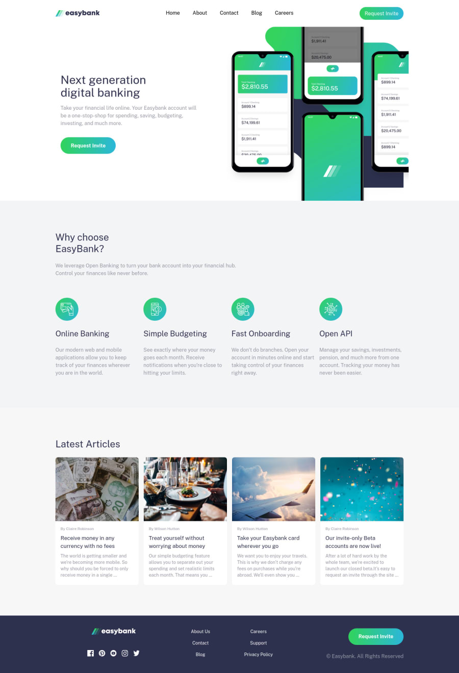
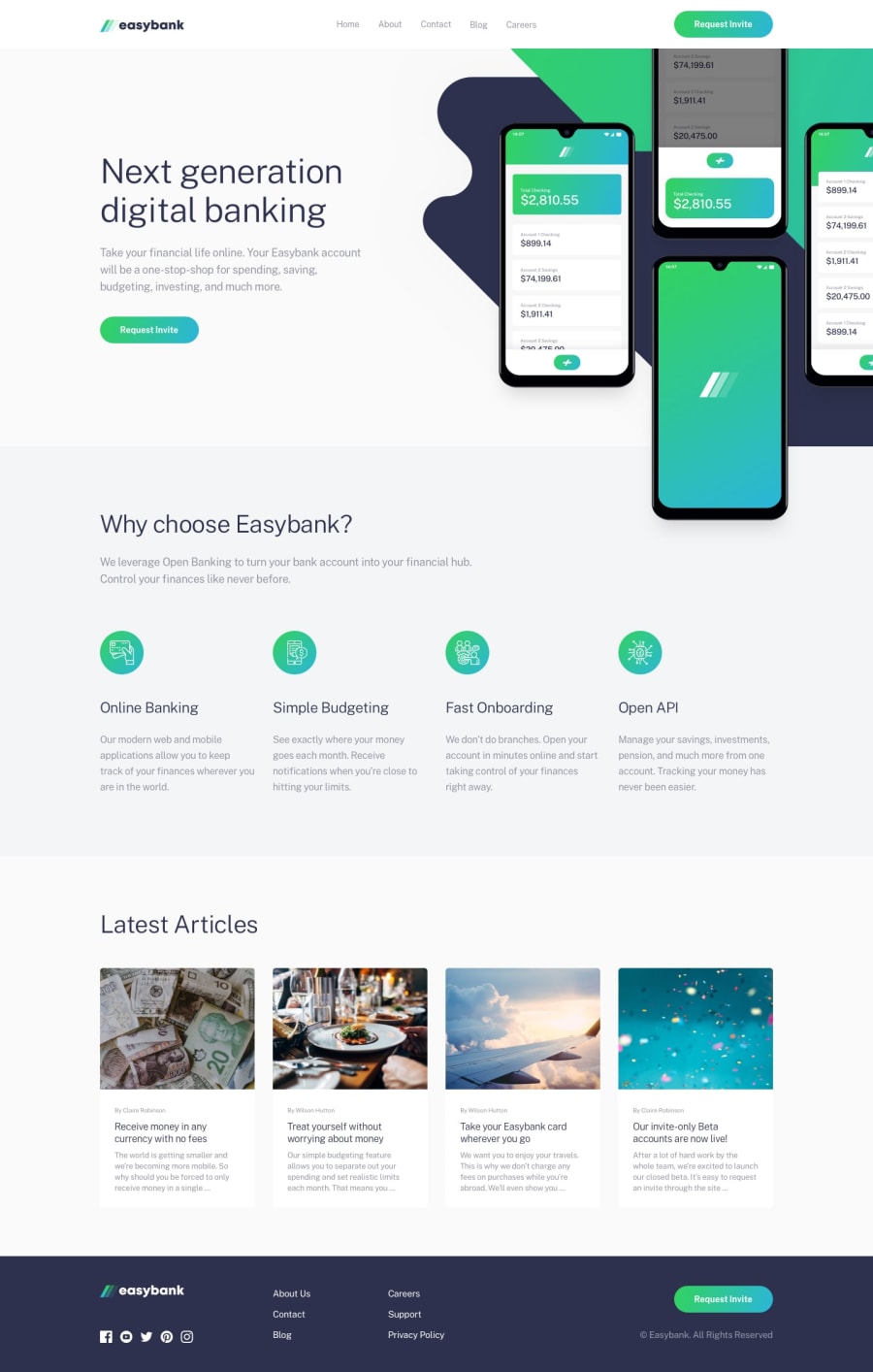
How to make hero image overflow only in one direction acc. to the design given ?
Community feedback
- @emestabilloPosted almost 3 years ago
Hey @abhikr4545, looks good, congrats! Solving the issue with the background would involve removing
overflow: hiddento the parentsection, and then adding a higher z-index to the nav as follows:position: relative; z-index: 1; background-color: white;Just a couple more thoughts:
- I suggest increasing the breakpoint because the layout looks tight at 768px. The hero paragraph is touching the phone image and the side by side columns have little breathing room. The text on the articles are also getting cut off and the images are stretched.
- articles, footer list items, and social icons could be wrapped in
<a>tags
Hope this helps!
Marked as helpful1
Please log in to post a comment
Log in with GitHubJoin our Discord community
Join thousands of Frontend Mentor community members taking the challenges, sharing resources, helping each other, and chatting about all things front-end!
Join our Discord
