
John
@MiyaoCatAll solutions
- Submitted 7 months ago
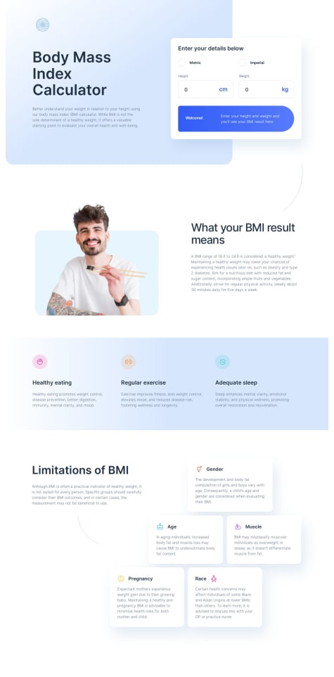
BMI Calculator Webpage - Mobile first, JS, SASS/SCSS, Grid, Flexbox
- HTML
- CSS
- JS
I'd like to have a JSON file with all the different "ideal" weights for each height. I started working on it, but I didn't get it up and running. I created the JSON file with the data, but need to pull it into the webpage.
- Submitted 8 months ago
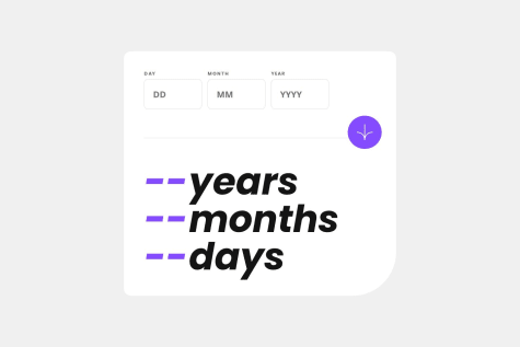
Calculator App - Mobile first, Javascript, SASS/SCSS
- HTML
- CSS
- JS
My javascript. It looks like it can be refactored. I feel like it could be written more efficiently.
- Submitted 8 months ago
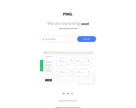
Coming Soon Page - SCSS, Javascript
- HTML
- CSS
- JS
Javascript, SASS, code organization.
- Submitted 8 months ago
Intro Component - Mobile first, Flexbox, SCSS, Javascript
- HTML
- CSS
- JS
- Organization of my code.
- SCSS
- Javascript. I think my JS could be refactored as there's a lot of repeating coding.
- Submitted 9 months ago
Landing Page - Mobile first, Flexbox, SCSS, Javascript
- HTML
- CSS
- JS
- Naming the classes.
- Javascript
- Ways to organize my CSS
- Methods to systematically create margins and paddings. Something more uniform than what I'm currently doing.
- Submitted 9 months ago
Four Card Feature - Mobile first, Flexbox, SCSS
- HTML
- CSS
I could really use some help with naming conventions. I'm not sure what to name the divs that would make the most sense. I don't want to think about it for too long so I end up going with something that may not be intuitive in the long run or for other devs.
- Submitted 9 months ago
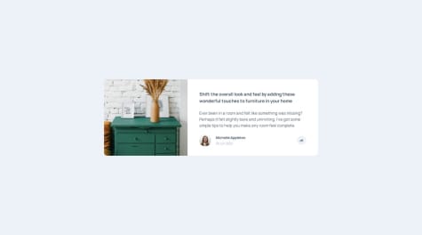
Article Preview - Mobile first, SCSS, Flexbox, Javascript
- HTML
- CSS
- JS
If anyone has feedback on the pop-up or a better way to open and close it, please let me know!
I also wanted the share menu to rise up from the bottom of the parent div, but I couldn't figure out how to do that with transform/translate. I need to learn transitions better as well.