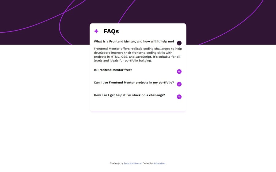
Design comparison
Solution retrospective
I used flexbox to position everything. I didn't use any JS, were we supposed to? The challenge tag includes JS so not sure about that.
I could use some help in getting the margins right. I'd like to have it more structured and systematic so I'm not just adding margins to specific elements and sides till it looks "right".
I'm not great with accessibility. Please tell me what I need to add/change in this regard.
Let me know what you think. Always open to feedback!
Community feedback
- @danielmrz-devPosted 10 months ago
Hey @MiyaoCat!
Nice solution!
About your question:
I didn't use any JS, were we supposed to?
Not at all. Those are suggestions, but if you can manage to finish the project without using JavaScript, it's okay.
- Also, a suggestion:
📌 You can use both
background-colorandbackground-imagetogether on the body in order to create that background pattern. They will not cancel each other.I hope it helps!
Other than that, great job!
0
Please log in to post a comment
Log in with GitHubJoin our Discord community
Join thousands of Frontend Mentor community members taking the challenges, sharing resources, helping each other, and chatting about all things front-end!
Join our Discord
