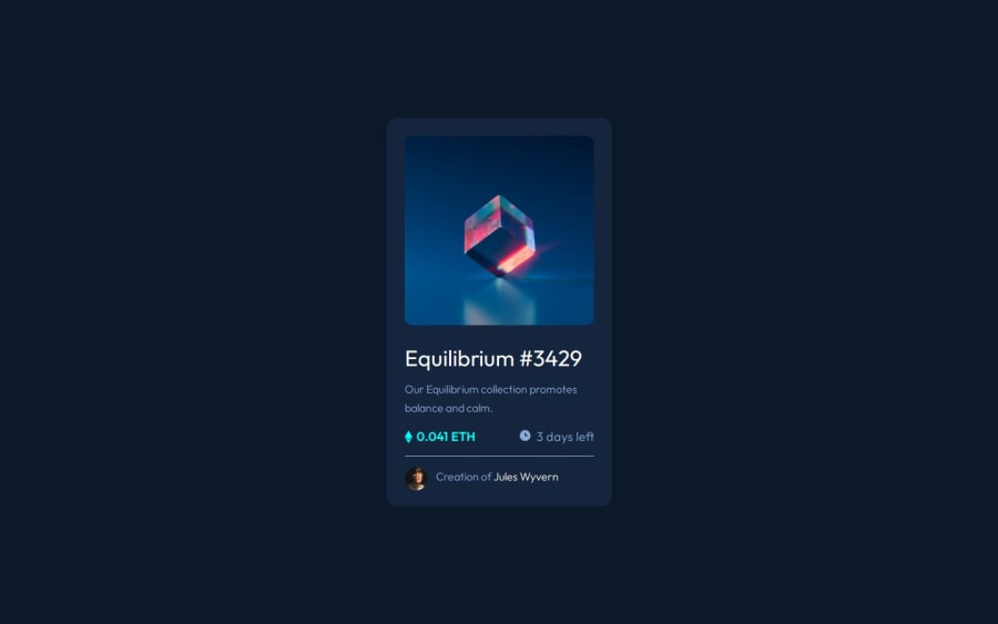
Design comparison
Solution retrospective
I couldn't figure out the hover effect so I'm submitting now to see other people's solutions.
I was able to get the view-icon with the background-color to appear on hover, but the icon is too big and the opacity too strong.
Community feedback
- @VenusYPosted 9 months ago
Well done on completing this challenge!
I saw that you fixed the issue with the view icon by adding
padding: 7rem
to.overlay-icon
.While this works on larger screen sizes, if you shrink the viewport's width enough, I found that you start running into overflow issues because the padding + width of the view icon won't fit within the card.
The initial cause of your issue with the view icon was this bit of code here:
.nft img { width: 100%; }
This combinator selects every descendant img element of
.nft
, including those that aren't direct children.In your case, this includes the view icon, which means the width of the view icon was set to 100% as well.
To fix this, you can make one small change:
.nft > img { width: 100%; }
This ensures that you're only selecting direct children of the
.nft
element.You can now remove
padding: 7rem
from.overlay-icon
.After doing so, you'll find that you run into the problem of the overlay no longer spanning the entire height of the NFT image.
You can fix this by simply adding
height: 100%
to.overlay
.Finally, you can add
display: block
to the NFT image to remove that small bit of whitespace underneath the image that you may have noticed.Other than that, well done once again for completing this challenge! You did a great job at replicating the design.
Hope this has been helpful! :)
Marked as helpful2 - @MiyaoCatPosted 9 months ago
Thank you so much! That was incredibly helpful! I was wondering why the
.overlay
was appearing so big.Do you know why the bit of whitespace appears at the bottom if I don't do
display: block
to the NFT image?1@VenusYPosted 9 months ago@MiyaoCat No worries! I'm glad I was able to help you out. :)
As for the whitespace, I believe it shows up on all inline elements for layout purposes, but I haven't read about it beyond that, so I couldn't tell you in detail. If I find an article on it that tells me more, I'll be sure to link it here for you.
Good luck with all your future projects! :)
0
Please log in to post a comment
Log in with GitHubJoin our Discord community
Join thousands of Frontend Mentor community members taking the challenges, sharing resources, helping each other, and chatting about all things front-end!
Join our Discord