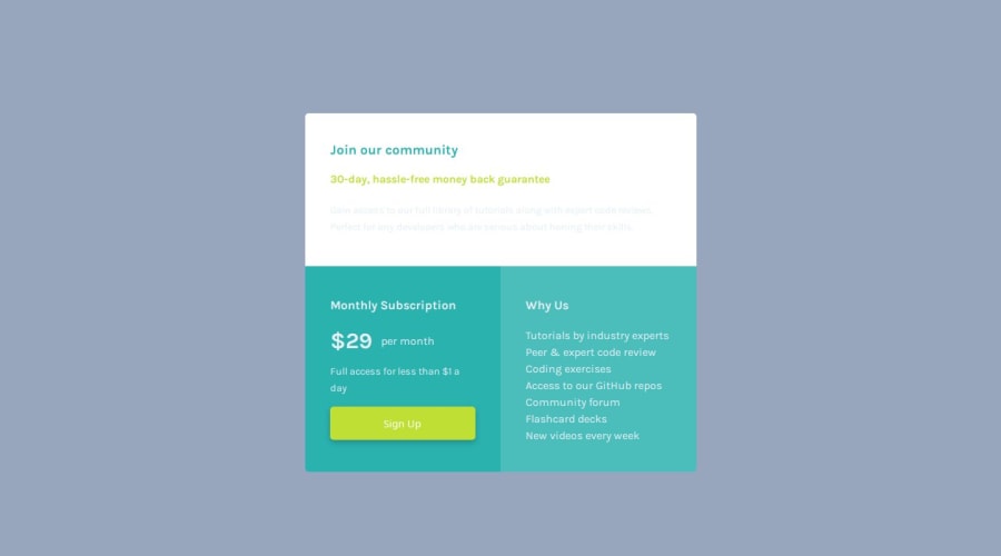


Design comparison

Solution retrospective
I completed this fairly quickly.
What challenges did you encounter, and how did you overcome them?I don't know if I got the margins and spacing right. Might have to upgrade to get the Figma files.
Community feedback
- @grace-snowPosted 9 months ago
Hi
Try to get this closer to the design with the colors. This looks quite different at the moment and some text is completely unreadable.
There are some important foundational errors in here you need to fix too:
- Each page can only have one h1. That's a page title. Heading levels really matter. You can't have multiple h1s like this.
- Sign up would navigate somewhere. That means it's a link not a button. Make sure you understand the difference between them.
- It's better for performance to link fonts in the html head instead of css imports.
- Font size must never be in px, especially not on the root! That one line of css makes this immediately inaccessible. Use rem for font size and don't change it on roof or html. https://fedmentor.dev/posts/font-size-px/
- Never limit the height of elements that contain text, including the body. This is broken on smaller phone screens because you've limited the height of the body. Use min-height instead so the body is allowed to be taller than the viewport height when needed.
- It's unusual to write line height in rem. Not a problem but unusual. Usually line height is unitless like 1.5.
- You can set border radius at component level along with overflow hidden to crop out the overflowing child corners.
- Avoid nesting css selectors like this. It will become a nightmare to manage on larger projects. https://fedmentor.dev/posts/sass-nesting/
- The button link must not have height (same principle as above, don't limit height). Use padding instead on this. Usually this kind of padding would be in em so it scales with the button text size.
- Media queries must be defined in rem or em not px. https://fedmentor.dev/posts/responsive-meaning/.
- Max widths must be in rem on the component and it must not have a max height.
- The rows do not need to be defined at template level and don't need to be equal. Try not to use % on grid template if you can use fr units.
Marked as helpful0@MiyaoCatPosted 8 months agoThank you! This was incredibly helpful! I applied the changes you laid out. I didn't realize setting the font-size in the root would throw everything off. I'll be more mindful of nesting. I've already kind of run into specificity trouble so I see how it can easily get tangled.
@grace-snow
0

Please log in to post a comment
Log in with GitHub
Join our Discord community
Join thousands of Frontend Mentor community members taking the challenges, sharing resources, helping each other, and chatting about all things front-end!
Join our Discord