

Design comparison
SolutionDesign

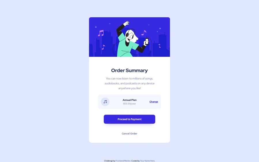
Solution retrospective
Not much to this one...if you seen anything that can be improved let me know! Is my CSS efficient? Could I refactor it to so it's less code?
Community feedback
- @hectorestebanmPosted 9 months ago
Hola, una cosa que podrías mejorar es modificar la línea de tus margenes en el button. Debería quedarte así: margin: 32px 0.
De esa forma agregas solo margin 32px arriba y bajo, y margin 0 izquierda y derecha, de esa forma te quedaría más parecido al modelo del desafio.
Espero te sirva, saludos.
0

Please log in to post a comment
Log in with GitHubJoin our Discord community
Join thousands of Frontend Mentor community members taking the challenges, sharing resources, helping each other, and chatting about all things front-end!
Join our Discord