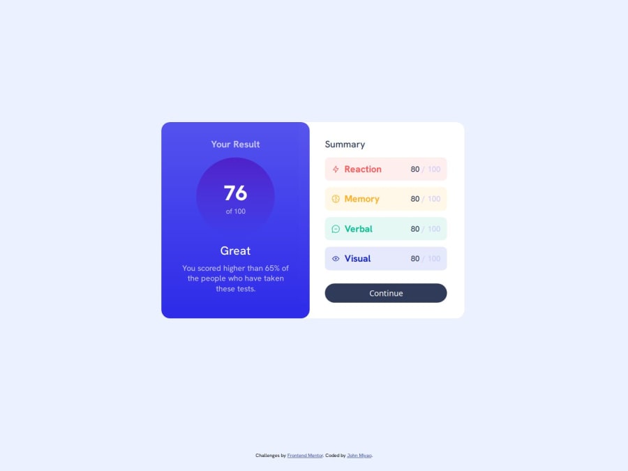
Design comparison
Solution retrospective
I originally wrote this in PHP to pull in the data from the JSON file. I used PHP because that's what I'm familiar with and I like that you can write PHP in-line with the HTML. However, I had to change it to a static HTML file because I had trouble hosting it on one of the preferred sites. I did however host it on my own site here.
I noticed on Desktop that the blue part of the component kind of overlaps the Summary part. I used position: relative/absolute and z-index to make sure that there's no space between the two elements. Is that the best way to accomplish this?
I had some trouble with the spacing originally because the live version looked nothing like my local version. Then I realized I didn't include the meyer-reset file and that seemed to fix things.
Would love any feedback!
Community feedback
Please log in to post a comment
Log in with GitHubJoin our Discord community
Join thousands of Frontend Mentor community members taking the challenges, sharing resources, helping each other, and chatting about all things front-end!
Join our Discord
