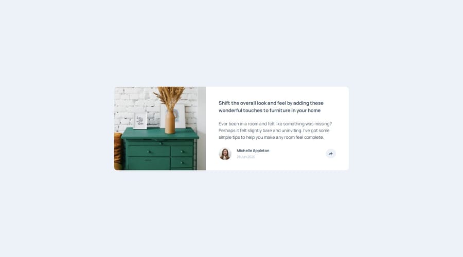
Design comparison
Solution retrospective
Getting the Javascript to work properly was the most difficult part and I still don't like my solution.
Also, getting the little triangle below the pop-up in the desktop view doesn't seem the most elegant. I added a blank div and filled in the border of the div to look like a triangle, then positioned it appropriately.
What specific areas of your project would you like help with?If anyone has feedback on the pop-up or a better way to open and close it, please let me know!
I also wanted the share menu to rise up from the bottom of the parent div, but I couldn't figure out how to do that with transform/translate. I need to learn transitions better as well.
Community feedback
Please log in to post a comment
Log in with GitHubJoin our Discord community
Join thousands of Frontend Mentor community members taking the challenges, sharing resources, helping each other, and chatting about all things front-end!
Join our Discord
