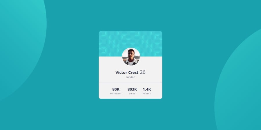
Design comparison
Solution retrospective
This challenge wasn't too difficult. It's helping me practice position relative/absolute with the background and profile avatar. I'm not sure about my placing of the circles in the background.
Community feedback
- @danielmrz-devPosted 9 months ago
Hello @MiyaoCat!
Your solution looks great!
The background pattern with the circles is a bit tricky, but you don't need separate containers to create it as it's possible to work with multiple background images at the same time. Here's how you can do it:
📌 Add this to the body:
  background-color: var(--Dark-cyan);
  background-image: url("./images/bg-pattern-top.svg"), url("./images/bg-pattern-bottom.svg");
  background-repeat: no-repeat, no-repeat;
  background-position: right 52vw bottom 35vh, left 48vw top 52vh;
I hope it helps!
Other than that, you did an excelent job!
Marked as helpful0@MiyaoCatPosted 9 months agoI did not know this! I knew you could add a background-image in CSS, but I did not know you could have multiple images/urls. Thank you so much! @danielmrz-dev
1
Please log in to post a comment
Log in with GitHubJoin our Discord community
Join thousands of Frontend Mentor community members taking the challenges, sharing resources, helping each other, and chatting about all things front-end!
Join our Discord
