Design comparison
SolutionDesign
Solution retrospective
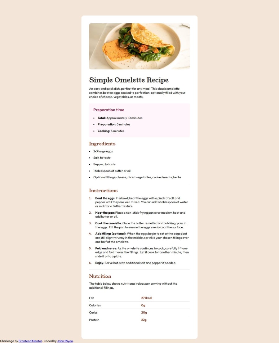
I had a lot of trouble with the spacing of the <li>'s. If someone wouldn't mind looking at how I styled them and provide feedback, that would be great! I styled the <ul> and <ol> differently. I use meyer-reset to start of with zero styling.
As usual, please let me know how I can make it more accessible as well. I don't know anything about aria standards so any input there is helpful.
Community feedback
- @MikoyzskiePosted 10 months ago
Hi John!
- if you are trying to make spaces between them, try using display: flex, flex-direction: column, then add gaps between them
- for spaces between texts and bullets which is very tricky, try to use other css pseudo classes like ::after or in this this case ::marker so you will have a more freedom on styling them
- hope this helps, man
Happy Coding!
Marked as helpful0
Please log in to post a comment
Log in with GitHubJoin our Discord community
Join thousands of Frontend Mentor community members taking the challenges, sharing resources, helping each other, and chatting about all things front-end!
Join our Discord
