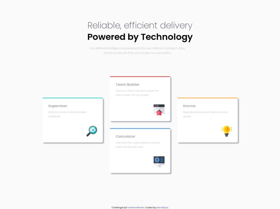
Design comparison
Solution retrospective
Setting up my SCSS without having to look up any reference material.
What challenges did you encounter, and how did you overcome them?Setting up the cards took a tiny bit of finessing. It wasn't hard, but not sure if my solution is best. I kept the cards in display: flex; flex-direction: row; and I just transformed the two middle cards up on the Y axis. I also kept the cards container tight so they would stay in the "diamond" shape.
I could really use some help with naming conventions. I'm not sure what to name the divs that would make the most sense. I don't want to think about it for too long so I end up going with something that may not be intuitive in the long run or for other devs.
Community feedback
Please log in to post a comment
Log in with GitHubJoin our Discord community
Join thousands of Frontend Mentor community members taking the challenges, sharing resources, helping each other, and chatting about all things front-end!
Join our Discord
