Design comparison
SolutionDesign
Solution retrospective
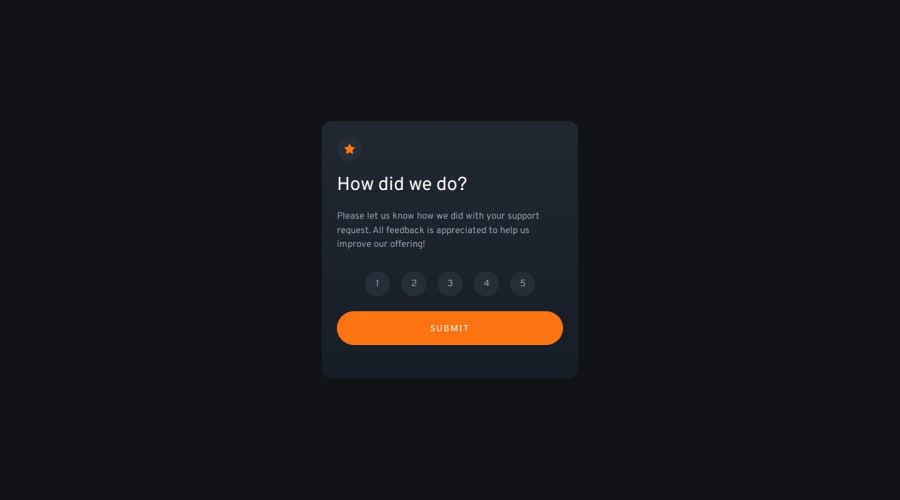
I initially struggled with how to display the numbers. I went with <li>'s because it seems more like an ordered-list to me. I thought about using some sort of form function like radio buttons, but I didn't want to deal with styling those.
I think my padding and margins may be a little off. I look at the design images in Affinity Designer and try to get it exact to the pixel, but it wasn't working for me this time so my mobile card is slight bigger.
Let me know what you think!
Community feedback
Please log in to post a comment
Log in with GitHubJoin our Discord community
Join thousands of Frontend Mentor community members taking the challenges, sharing resources, helping each other, and chatting about all things front-end!
Join our Discord
