
@arey-dev

Katja Danilova
@katjadanilovaAll comments
- @katjadanilova
Hey there! Yep, I can't see anything. You might want to try deploying it on Vercel - I have found it easier with react apps.
Marked as helpful - @nyrellcl@katjadanilova
Hi, Nyrell!
Well done! I liked it that you added an extra feature and your neat HTML structure :)
I think your implementation would benefit from adding a background color for the whole page, so that the notifications container stands out more. Additionally, you missed some hover states - bold texts should change color when hovered over.
When I implemented this project, I also made it more challenging by adding the ability to interact with each notification (or ´article´ in your case) - so that the user can read them one by one. I learned a lot from doing this, so you may want to give it a try too.
Hope it helps!
Marked as helpful - @czechoslovakia36@katjadanilova
Hi, Vivek!
I really liked some of your design choices; rolling dice in particular was nicely done!
I noticed that the HTML and Accessibility report had some complaints. This is because it is expected to have button texts and image descriptions, so that people who rely on screen readers can understand what is happening on the screen. To make it accessible for a screen reader, you could use a
divinstead of a button and addaria-label="Get another quote".Additionally, on hover, you could add a glowing effect behind the dice container, as it was offered in the task.
Hope it helps :)
- @rkritchat@katjadanilova
Hey there!
That's a great start! Your design implementation looks good. There is a minor issue in mobile view (the Kimberley Smith block is misaligned with the text), and some hover states are not implemented as specified in the task.
You could also add functionality, as the task requires. The text "Mark all as read" could be a button that changes the notification state, and clicking on each notification could also change its state. The number of unread notifications should also be updated accordingly.
I hope that helps :)
Marked as helpful - @SebastianGula1@katjadanilova
Hey, Sebastian!
Congratulations on completing your project!
I suggest removing the container height as it causes issues with longer quotes; gaps between elements can disappear or elements can be superimposed on each other.
You could also consider adding a loading element to your app, as the API has a noticeable loading time. Of course, this wasn't part of the initial task :).
Marked as helpful - @shavindaL@katjadanilova
Hey there!
The design looks good and has been implemented according to the initial description - well done!
I noticed that your design isn't mobile-friendly when I tested it with Google Developer Tools. It has no margins and the attribution is too low.
- @4002-Nonye@katjadanilova
Hey there!
The design looks good and has been implemented according to the initial description - well done! However, I would suggest not wrapping the advice-container in a spinner. Because both the spinner and the container are visible when the spinner is active, which is not the expected behavior. Additionally, the container jumps up and down every time the spinner appears or disappears.
Instead, you could have a separate div that wraps both the container and the spinner, and shows one or the other depending on the
isLoadingstate.Marked as helpful - @mobalti@katjadanilova
Hi!
Your solution looks really good. Light and dark mode switch is a very nice additional touch to the whole design, and your dark mode colours look neat!
Visually, I haven't noticed any problems, and my eye just caught some issues in the accessibility report. Here is an idea:
- I believe your
aria-live="polite"is the one that gives the first error in the report. Here is an article about using this property: https://bitsofco.de/using-aria-live/, and I am not sure you have a good use case for it. It might be that you rather want to have a dynamic value foraria-labelthat would say "Switch to light theme" or "Switch to dark theme" respectively.
Marked as helpful - I believe your
- @Lukiticas@katjadanilova
Hi, Lucas!
Your animations are fantastic, they are elegant and perfectly match the design. I regret only not thinking of them myself :D.
The only thing I noticed that is slightly off, is that the phone number field doesn't accept a "+" at the beginning of the number.
- @Eileenpk@katjadanilova
Hi, Eileen!
I reviewed your solution after completing my own and found it to be really good! I noticed a few things, such as:
- inputs and button heights appearing shorter when errors are present (I'm not familiar with Tailwind, so I'm unsure of the cause) then when there are no errors;
- based on my short research, I discovered that bank card numbers can have up to 19 digits;
- expiration year in your solution can currently be in the past.
I appreciated your method of formatting the card number. I came up with a slightly different one, and it's always enlightening to have alternatives :) here is mine:
value.replace(/\s/g, "").match(/.{1,4}/g)?.join(" ")Marked as helpful - @BreiaJohn@katjadanilova
Hey!
I have a few suggestions that you might find useful:
- your picture element is outside the container, although it should rather be inside, and only button (in your case) to be
position: absolute. - Accessibility report requires buttons to have a label. So, in this case, it might be better to opt in for a
divthat has animginside it, withalttext that would describe the action. - Accessibility report also wants you to have a
maintag inside yourbodyinstead of adiv.
Please let me know if my suggestions aren't helpful :)
- your picture element is outside the container, although it should rather be inside, and only button (in your case) to be
- @Myudro33@katjadanilova
Hey there,
I have a couple of suggestions:
- Your name verification expects a bit too long names. "Tom Saar" for example isn't accepted by your form, but is a proper name in my country.
- Bank card number can be as long as 19 digits, you have a limit for 16.
- CVC should have at least 3 digits, and your form accepts even with two.
- If CVC field has an error, MM/YY fields are misaligned.
I really liked your transition to a final component. Nicely done!
- @katjadanilova@katjadanilova
Do you have any ideas why do I get an error "Attribute
modelvaluenot allowed on elementdivat this point." in HTML validation report? - @WalidSahnoun0001@katjadanilova
Hi!
I think you have quite clean solution. You probably missed that provided data also has
roleandlevelthat should be part ofjob-tags. User can filter by them as well. In terms of css, I noticed that in the original design filter box should float above the background image.Your accessibility report has a couple of warnings as well - two of them require you to have a
h1(given design, however, doesn't provide with a good h1 opportunity), and another recommends to havemaintag instead ofdivwith anid="root"in yourindex.htmlfile.I hope it's helpful!
Marked as helpful - @SwiichyCode@katjadanilova
Hi!
I liked your implementation!
I liked a transition effect you've implemented when a user changes plan from monthly to yearly - quite neat 👏.
I liked that you already implemented email and phone verification - and noticed that phone verification perceives a number that starts with a "+" as an incorrect one. The "+" symbol indicates that the number is an international phone number and is followed by the country code. This helps to ensure that the phone number is formatted correctly and can be properly recognized by phone systems and carriers.
There are some differences with initial design, but I personally am good with them :)
- @festsnusa@katjadanilova
Hi!
I liked that you opted in for a full-width header, bold font and more roundness in your components - I did it differently, and it was a cool comparison to see how you solved the same challenge I've dealt with just recently.
Here are couple of things I've noticed:
- green-ish background ends in the middle of the screen when all listings are listed. My guess is it's because you have
height: 100vhin your .main class. Once I removed it in chrome devtools, the whole page had a correct background color, but maybe there is a better solution. - In the initial design only listings that are "featured" have a green line on the left.
I hope it helps :)
- green-ish background ends in the middle of the screen when all listings are listed. My guess is it's because you have
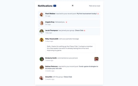
- @cenkderman@katjadanilova
Hi!
Congrats on finishing this project! I've noticed that your design differs from the given one: notifications component has a white background instead of a blue, and only unread notifications are blue. Notifications component also has a shadow in the initial design.
I hope it helps :)
Marked as helpful - @syntaCorp@katjadanilova
Hi!
You've done a good job here! Here is how you can center the button to always stick when the content changes:
- add
display: flex,flex-direction: column, andalign-items: centerto your .card class. This will help the button and all other elements always be in the center. - your .dice class then could have
bottom: -26pxinstead of having left and right properties and positive value for bottom. Negative bottom will help the dice to preserve its position whenever the card size changes.
Aside from that, I would recommend to have all of the paddings set to 2em in your .card class. Having your left and right paddings set to 0 right now affects UI when quote text is long.
I hope it helps!
Marked as helpful - add