Design comparison
Solution retrospective
feedback is welcomed
Community feedback
- @katjadanilovaPosted about 2 years ago
Hey there!
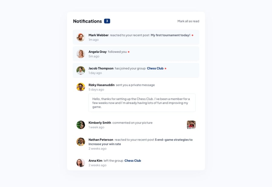
That's a great start! Your design implementation looks good. There is a minor issue in mobile view (the Kimberley Smith block is misaligned with the text), and some hover states are not implemented as specified in the task.
You could also add functionality, as the task requires. The text "Mark all as read" could be a button that changes the notification state, and clicking on each notification could also change its state. The number of unread notifications should also be updated accordingly.
I hope that helps :)
Marked as helpful0@rkritchatPosted about 2 years ago@katjadanilova Thank you for the feedback. I'll try to apply all of them. Cheers!!
1
Please log in to post a comment
Log in with GitHubJoin our Discord community
Join thousands of Frontend Mentor community members taking the challenges, sharing resources, helping each other, and chatting about all things front-end!
Join our Discord
