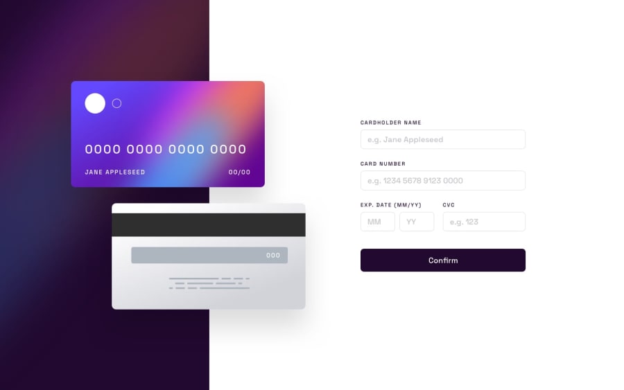
Interactive card implemented using Vue and Typescript
Design comparison
Solution retrospective
A small and interesting project to work on, and I decided to implement it using Vue. I incorporated additional form validation and made several UI adjustments, such as ensuring the bank card size was proportionate and adding a shake effect to the button. What was your solution for adding spaces in the card number field?
Please log in to post a comment
Log in with GitHubCommunity feedback
- @sulemaan7070
hey Katja Danilova😄, congratulations on completing the challenge here are a few tips to make your site better..
1.I see that you have used the
body->flexbut that property is causing extra space(margin) on the left and right sides...2.The validation seems very nice..The only thing which seemed like a bug is when I am entering the
iiinto theYYinput field...there was no validation error..I really liked the button shaking-animation upon entering the wrong input great job, happy coding👍🏻🔥💯
Marked as helpful - @katjadanilova
Do you have any ideas why do I get an error "Attribute
modelvaluenot allowed on elementdivat this point." in HTML validation report?
Join our Discord community
Join thousands of Frontend Mentor community members taking the challenges, sharing resources, helping each other, and chatting about all things front-end!
Join our Discord
