Eli Silk
@elisilkAll solutions
Tic tac toe game with minimax algorithm for the CPU player
#accessibilityPSubmitted 4 months agoMy JS is disorganized at the moment, as I was trying a bunch of things and different approaches. So I should probably take some time to clean it up and refactor. I'd love to hear how others handled keeping track of the game state and all the other scripting parts of the challenge.
I do have a small question about why the "O" svg icons seem to be cut off a little bit. Anyone have thoughts?
And I am new to animations/transitions, and so would appreciate feedback on how I did those, and how they could be improved.
I'm also up for any other kind of feedback. Thanks in advance.
BMI calculator with CSS custom properties and CSS grid layout
#accessibilityPSubmitted 5 months agoComparing the design to my solution, the background gradient color in the top hero section is definitely off. The design has much more of the lighter blue and my solution has much more of the darker blue. I attempted to use the gradient parameters directly out of the settings from the Figma file, but given how off it is, I clearly didn't do that correctly. I also tried using the Figma Solid and Gradient to CSS plugin to translate the gradient in the Figma design directly into CSS, but that didn't give me great results either. I'd appreciate hearing how others figured out the best gradient for this design, and more generally about a better process for translating Figma design gradients into CSS. Thanks in advance.
FAQ accordion - CSS only, semantic HTML, and keyboard accessibility
#accessibilityPSubmitted 6 months agoI am a little confused about why I'm getting some HTML validator errors by using the
nameattribute in thedetailselements. Can anyone help me figure out what I did wrong? Seems to me like I am using thenameattribute in the appropriate way. But maybe I am missing something? 🤔Tip calculator app using client-side validation
PSubmitted 6 months agoI would love to figure out better ways to structure the JavaScript code so that I was relying more on pure functions and objects than I currently am (see Learning Path reference). Feels like I lot of my code was slapped together to get it to work, rather than thinking about what the best way is (or at least a more elegant, efficient way). Any ideas? 🤔
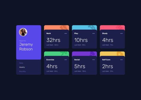
Time tracking dashboard with JavaScript to input & switch between data
PSubmitted 6 months agoI'm not sure about my JavaScript approach. I chose to display all of the data, but then hide the elements that were not selected at the time. And then when selected, the JavaScript will show those selected data and hide the others. Would love to know if others have a better approach for doing this kind of thing.
Newsletter email sign-up form using client-side JavaScript validation
PSubmitted 6 months agoI am definitely uncertain about how I am handling the move to the success screen and the move back. I think I have a working solution that involves showing and hiding the success screen (without a page reload), but have no clue if my approach aligns with best practices. Would love to know about other effective approaches, or to learn about disadvantages to my approach.
Article preview component with responsive design + javascript tooltip
PSubmitted 6 months agoI'm not sure that my solution for the positioning of the share panel is the best option, and I'd appreciate learning about other approaches.
Testimonials grid section using CSS grid and BEM
#bemPSubmitted 8 months agoSuggestions about how to think about and refine the spacing between elements (e.g., grid and flexbox gaps, paddings and margins that seem specific to a particular element) so that they match the design but are still consistent within a design system, would be appreciated.
Responsive blog preview card utilizing fluid typography
#bemPSubmitted 8 months agoI feel like my text sizes, letter spacing, and line heights never quite match the solution. Not sure what the issue is there. I had access to the Figma file for this challenge, and so tried to design based around the given units in that design file rather than the jpg screenshots. So not really sure the best way to think about approaching that. Or maybe I made a mistake in reading the Figma file or in implementing the typography in some way.