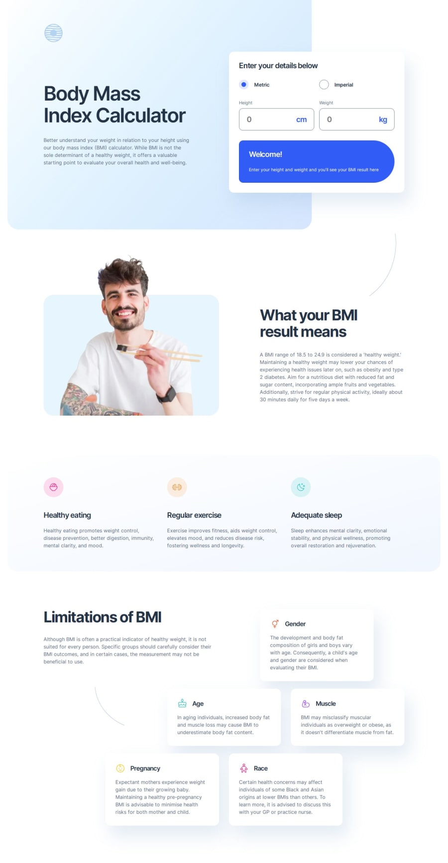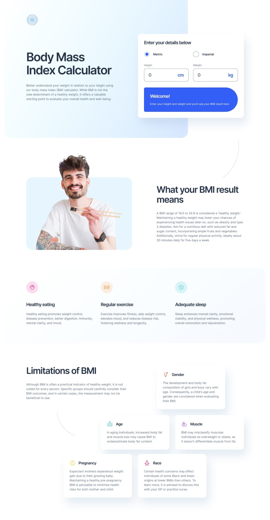
BMI calculator with CSS custom properties and CSS grid layout
Design comparison
Solution retrospective
This challenge was trickier than I had anticipated, especially with respect to the layout. But I learned a lot trying to figure out how to get CSS grid to be responsive and deal with overlapping elements and things like that. So it ended up being a lot of fun to work through those things.
What specific areas of your project would you like help with?Comparing the design to my solution, the background gradient color in the top hero section is definitely off. The design has much more of the lighter blue and my solution has much more of the darker blue. I attempted to use the gradient parameters directly out of the settings from the Figma file, but given how off it is, I clearly didn't do that correctly. I also tried using the Figma Solid and Gradient to CSS plugin to translate the gradient in the Figma design directly into CSS, but that didn't give me great results either. I'd appreciate hearing how others figured out the best gradient for this design, and more generally about a better process for translating Figma design gradients into CSS. Thanks in advance.
Community feedback
- P@NikitaVologdinPosted 4 months ago
Hi @elisilk! I agree that this one was tough! You did a great job with the pixel-perfect nothing to mention. It's a controversial form though.
- I suggest adding "overflow: hidden" to the span with the result and also using the
<output>tag instead of the span for accessibility reasons. - You could also add padding-right to the input fields to prevent the value from overlapping with its label. By the way, I like the idea of using label tags for the units.
- You implemented BMI calculation, but it's not quite accurate for very high input values.
Just opened your GitHub, and the overview is a masterpiece. Every section of it is breathtaking. The "What I learned" section is like reading a magazine.
Marked as helpful1P@NikitaVologdinPosted 4 months ago@elisilk you may try this one for the header gradient:
background: linear-gradient(130deg, #d6e6fe00, #d6e6fe), linear-gradient(130deg, #d6fcfe00, #d6fcfe);1P@elisilkPosted 4 months agoHi @NikitaVologdin!
Thanks for all the comments and suggestions. The
<output>element is definitely semantically appropriate for this case, and I see the accessibility advantages too. I didn't know it existed, so I appreciate you pointing it out.I know I need to work a little more on my calculations. I feel like it's the way I do my rounding, but I'll have to investigate a little more to figure it out.
Thanks again for taking such a careful look at my solution and offering so many helpful ideas.
Eli
0 - I suggest adding "overflow: hidden" to the span with the result and also using the
Please log in to post a comment
Log in with GitHubJoin our Discord community
Join thousands of Frontend Mentor community members taking the challenges, sharing resources, helping each other, and chatting about all things front-end!
Join our Discord
