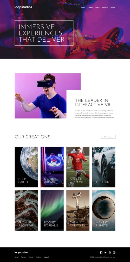
Submitted about 1 year agoA solution to the Loopstudios landing page challenge
Responsive landing page using Sass
accessibility, cube-css, sass/scss

P
@elisilk
Solution retrospective
What are you most proud of, and what would you do differently next time?
This was my first time using Sass, and I really only scratched the most basic surface level of it so far. But it was good to get it up and running, and I definitely have ideas for areas of Sass I can utilize in future projects. I also continued to try on CUBE CSS, but probably implemented some aspects of that methodology more faithfully than others. But progress, not perfection. Will be great to keep getting more experience with both CUBE CSS and Sass in future challenges.
Code
Loading...
Please log in to post a comment
Log in with GitHubCommunity feedback
No feedback yet. Be the first to give feedback on Eli Silk's solution.
Join our Discord community
Join thousands of Frontend Mentor community members taking the challenges, sharing resources, helping each other, and chatting about all things front-end!
Join our Discord