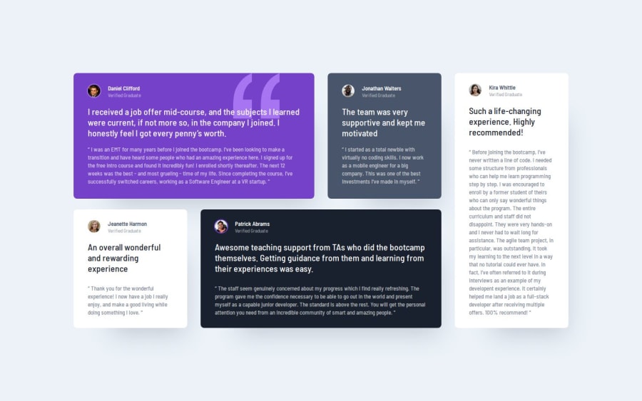
Design comparison
Solution retrospective
I enjoyed the general challenge of the layout and getting the different grid elements to span different rows and columns in the desktop view while keeping the order the same as in the mobile view.
What challenges did you encounter, and how did you overcome them?I struggled with getting the spacing to match the design, and found the Figma design file was not that clear about spacing. I was also probably too heavy-handed with box shadow, and so I still need to work on a design eye for matching those kinds of details.
What specific areas of your project would you like help with?Suggestions about how to think about and refine the spacing between elements (e.g., grid and flexbox gaps, paddings and margins that seem specific to a particular element) so that they match the design but are still consistent within a design system, would be appreciated.
Join our Discord community
Join thousands of Frontend Mentor community members taking the challenges, sharing resources, helping each other, and chatting about all things front-end!
Join our Discord
