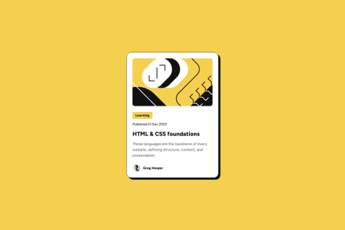
Responsive blog preview card utilizing fluid typography

Solution retrospective
I'm most proud of taking on the challenge of the "Ideas to test yourself" about noticing that the font sizes in this project are slightly smaller in the mobile layout and finding a way to reduce font size for smaller screens without using media queries. I was able to learn about how to use calc and clamp and vw units to implement what I think is a nice solution for this.
I feel like my text sizes, letter spacing, and line heights never quite match the solution. Not sure what the issue is there. I had access to the Figma file for this challenge, and so tried to design based around the given units in that design file rather than the jpg screenshots. So not really sure the best way to think about approaching that. Or maybe I made a mistake in reading the Figma file or in implementing the typography in some way.
Please log in to post a comment
Log in with GitHubCommunity feedback
No feedback yet. Be the first to give feedback on Eli Silk's solution.
Join our Discord community
Join thousands of Frontend Mentor community members taking the challenges, sharing resources, helping each other, and chatting about all things front-end!
Join our Discord