Submitted 6 months ago
Article preview component with responsive design + javascript tooltip

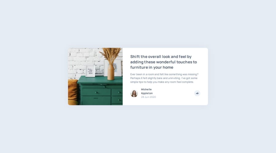
P
@elisilk

Design comparison
SolutionDesign

Solution retrospective
What are you most proud of, and what would you do differently next time?
I am proud of the overall setup with custom CSS variables. But I was definitely challenged with the different versions (mobile vs. desktop) of the social media panel. Next time, I would be thinking more about absolute vs. relative positioning, overflow, and z-index so that the solution comes together much faster.
What specific areas of your project would you like help with?I'm not sure that my solution for the positioning of the share panel is the best option, and I'd appreciate learning about other approaches.

Join our Discord community
Join thousands of Frontend Mentor community members taking the challenges, sharing resources, helping each other, and chatting about all things front-end!
Join our Discord