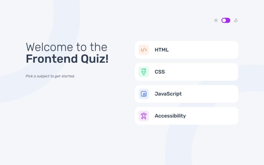
Frontend quiz app with fluid typography & spacing + light/dark theme
Design comparison
Solution retrospective
There was a lot in this challenge with layout, inputs/forms, and JavaScript processing. I enjoyed all the parts. There are definitely a few things I'd like to improve, but I feel like this initial solution gets much of the way there, including the ability to switch between light and dark themes. I didn't yet focus on the requirement of "Navigate the entire app only using their keyboard", so will work on that in my improved version.
Community feedback
- @AutumnsCodePosted 6 months ago
Thats a good solution.
I would like it even better if you don't have to press a second time submit to get to the next question.
0P@elisilkPosted 6 months agoHi @AutumnsCode,
Thanks for looking at my solution and for the comment. But I am a little confused as I understood the design to be pretty explicit about calling for this two-stage flow for each question. The two stages being that first the user chooses their answer choice and hits the "Submit Answer" button. And then second, the feedback (correct/incorrect) is given on that question and the "Next Question" button shows up to allow for advancing forward. Do you understand the design differently?
Eli
0@AutumnsCodePosted 6 months ago@elisilk Nope, not at all. Its just my personal opinion thats all :)
0P@elisilkPosted 6 months agoOkay, cool. That could be a nice way to go to personalize the app in the future.
0
Please log in to post a comment
Log in with GitHubJoin our Discord community
Join thousands of Frontend Mentor community members taking the challenges, sharing resources, helping each other, and chatting about all things front-end!
Join our Discord
