Submitted about 1 year agoA solution to the Contact form challenge
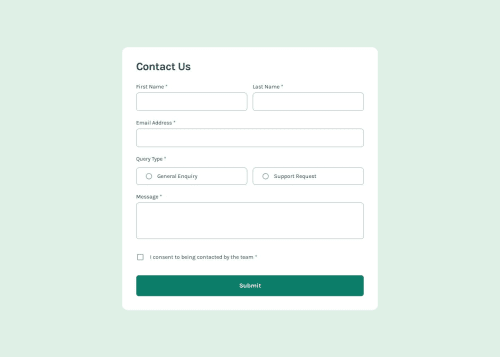
Contact form with keyboard accessible inputs
accessibility
P
@elisilk

Solution retrospective
What are you most proud of, and what would you do differently next time?
I worked hard to use semantical HTML for each of the form elements so that I could take advantage of the built-in interactivity and accessibility that come alongside those elements. Because of that approach, the form is fully keyboard accessible, and I hope it would be just as accessible to screen readers and other kinds of assistive technologies as well. I would love to hear if others feel there is some aspect to accessibility that I have not considered or that wouldn't be effectively accommodated in this solution.
Code
Loading...
Please log in to post a comment
Log in with GitHubCommunity feedback
No feedback yet. Be the first to give feedback on Eli Silk's solution.
Join our Discord community
Join thousands of Frontend Mentor community members taking the challenges, sharing resources, helping each other, and chatting about all things front-end!
Join our Discord